[BLOGGER] How to: A responsive Blogger-Design ✤✤✤✤✤ [+ Template 4 ya!]
Ich habe lange überlegt, was es zum zweiten Geburtstag werden soll. Und habe mich für ein anspruchvolles Tutorial entschieden. Für all diejenigen unter euch, die gar nicht wissen wollen, wie das geht, sondern einfach gern ein responsives Blogdesign hätten, die dürfen gerna auf diesen Link klicken, und zum Demo mit Instruktionen gehen.
Alle Anderen sind herzlich willkommen sich diesen überdimensionalen Post durzulesen. Aber das meiste davon ist eh nur Code, also nichts wovor man irgendwie eingeschüchtert sein sollte ^^
I've spent a lot of time thinking what special post I should write for my second blog birthday. I decided to a tutorial. It's on the trickier side. For the ones of you not even bothering how it's done but interested in a responsive blogger template, can click on this Link, which will bring you to the demo page, and instructions on how to customize it. Everyone interested in writing your own responsive blogger template is very welcome to read this post, which - sorry for that - has ended up being of quite some length. But most of it is code, so nothing to be frightened of ^^
Responsive, was bedeutet das überhaupt? Responsive bedeutet, dass sich die Seite der Grösse anpasst. Dass es also - egal ob auf dem PC, Tablet oder Handy - immer soweit funktioniert, dass nichts abgeschnitten wird. Es geht darum so benutzerfreundlich wie möglich zu sein. Und seien wir mal ehrlich, die mobilen Vorlagen von Blogger sind nicht wirklich etwas, was man sich gerne antut. Vor einer Weile (als die mobilen Aufrufe meines Blog auf fast 10% stiegen) habe ich mich zum ersten Mal wirklich mit responsivem Design auseinandergesetzt. Mir war schnell klar, dass das mit dem Blogger Markup nahezu unmöglich umzusetzen ist. Also habe ich mich kurzerhand dazu entschlossen das Markup selbst zu schreiben, und nur das Blog-Gadget zu übernehmen (ganz soweit, alles selbst zu schreiben, bin ich noch nicht, aber Oliver hat ne Serie dazu und am Ende werd ich's dann vielleicht schaffen ^^). Und weil responsive zu sein nun eines der grössten Ziele des Webdesigns ist, habe ich beschlossen ein Tutorial dazu zu machen.
Aber, ich muss es leider gestehen, das ist wirklich ein Tutorial, das nur diejenigen unter euch machen sollten, die sich mit HTML und CSS auskennen. Vor allem wenn ihr gerne Tutorials ausprobiert, müsst ihr euch darüber im Klaren sein, dass ihr alles was ausserhalb des Blog-Gadgets passiert, werdet umdenken müssen, da das ganze "Äussere" anders aussehen wird. Wir reduzieren die Unmengen an div-Containern. Wenn ihr mit dem Vorlagendesigner arbeiten wollt, ist es tonnenweise mehr Arbeit, und Blogger pfuscht dann in eurer CSS rum. Und da ich den Vorlagendesigner sowieso verabscheue, habe ich mich gar nicht erst mit den Variabeln auseinandergesetzt. Vorlagendesigner fällt also weg.
Ihr werdet alles im Editor machen, das heisst also, wenn ihr euch dort nicht wohl fühlt, lasst ihr es entweder nach dem Grundstyling noch etwas zu verändern oder ihr lasst es am liebsten ganz, mit dem responsiven Design, bis ihr soweit seid.
Aber ansonsten macht es total viel Spass. Ihr könnt dabei zusehen, wie aus einer Box-Skizze euer ganz persönliches Design manifestiert. Und es ist viel einfacher alles von Anfang an zu schreiben, als mit Grundmaterial Vorstellungen umsetzen zu wollen.
Und wenn ihr euch bei der Planung Mühe gebt, ist das Schreiben ein Kinderspiel.
Make a blogger blog responsive. Not the easiest task ever. But it's doable. It asks for its own markup and demands quite some time and pacience, but it is possible.
Responsive, what does that mean anyways? Responsive means that your webcontent adjusts to the size of the browser window, or mobile screen size. So your page adjusts to PC, tablet or mobile phone. The aim is to be as user-friendly as possible. And honestly, the mobile templates of blogger itself are horrible. Some time ago (as more and more people accessed my blog from mobile devices - nearing 10%) I first faced responsive desing and realized that it's impossible to create a responsive design with the markup blogger gives you. So I decided to write my own markup and only use the blog widget from blogger (not yet able to write that by myself, but I'm learning ^^) And because being responsive is currently one of the biggest aims of modern web design I decided to write a tutorial about it.
To be honest, this really is a demanding tutorial which only the ones with HTML and CSS skills should follow. You're not gonna use the templte designer and if you like trying out tutorials you will have to rethink everything that works outside of the blog widget.
If you don't feel comfortable in the editor, you should not do this.
But it's so much fun! You can see how it develops from a simple box sketch to a custom desing. And it's a lot easier to work out something personal if starting anew than messing around with already existing blogger code.
And if you really take the planning to heart writing it is a piece of cake.
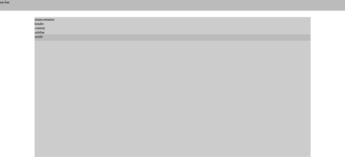
Als erstes empfiehlt es sich, für sich auf Papier eine Skizze zu machen. Eine Skizze bedeutet allerdings nicht ein Bidl des Headers zu zeichnen und sich in kleinen Details zu verlieren. Es geht darum in HTML zu denken, nicht in CSS, wenn ihr verteht was ich meine. Zeichnet euch die Container auf.
Und dann, wenn ihr diese Skizze habt, dann macht ihr euch eine "HTML-Skizze", in der ihr jeden Container mithilfe von CSS platziert.
Mein letztes Template sah in so einer Skizze folgendermassen aus:
Planning is the key to a positive outcome of this project. That rule doesn't apply to responsive design only but really any kind of webdesign. If you've got no idea what you wanna end up with, that's not good.
First of all you should draw a sketch of it on paper. With a sketh I don't mean a little picture of what it shall look like in the end. Don't loose yourself in details. You need the bases, so think in HTML, not CSS, if you get what I mean. Draw the containers. As soon as you've done that, you wanna transform this sketh into HTML and CSS. Make the divs into boxes and place them with CSS.
The sketch of my last template looks like this.
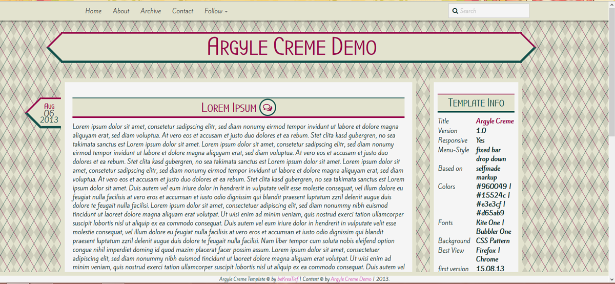
Es handelt sich um responsives Design, also stellt sicher, dass ihr bereits hier alle Breiten in % angebt. Jetzt möchten wir aber unser responsives Design skizzieren. Meine Skizze sieht folgendermassen aus. Dieses Markup ist übrigens nicht nur das Markup von Argyle Creme sondern auch meines momentanen Templates und das von Responsive Simple. Ihr seht, dass man mit diesem Markup wirklich verschiedene Looks erstellen kann.
Since it's gonna be a responsive desing you wanna make sure that each width of your container is given in %, not pixels or anything else. Now we wanna sketch the template we're writing. It looks like this.
Okay, wie ihr diese hinbekommt, das möchte ich mit euch jetzt durchgehen, denn das ist bereits eure Basis-CSS und ausserdem das Markup eures Blogs.
Wir machen das ganze mit simplem HTML. Ein Blogger-Blog wird in XHTML geschrieben, doch das Markup bleibt sich gleich.
Ihr öffnet ein neues Dokument und speichert es als .html-Datei ab. Wir werden kein separates Stylesheet einfügen. Da, es nur um eine Skizze geht.
Im HTML-Dokument schreibt ihr folgendes.
Okay. I'm gonna explain you how to achieve a sketh using this example. This sketh is actually our html markup and the base of our CSS.
We'll do our sketch with simple HTML even though a blogger template is written in XHTML, but the markup stays practically identical.
Open up your editor and a new document. Save it as a .html file. We're not gonna use a sepereate style-sheet, since it's only a sketch.
In your file, write the following.
Im body-Bereich werden unsere Container platziert. Diese sehen wie folgt aus:
We place our containers in the body-section. This will look something along those lines:
Das gesamte Markup ist damit schon geschrieben. Als nächstes fügen wir style-Klammern hinzu, in die wir unsere CSS schreiben.
And that's basically our whole markup. Next we'll add some style-tags into which we're gonna add our CSS.
Die CSS für die Navbar, die Credits und den Container sind schnell geschrieben. Damit wir das ganze sehen können, definieren wir noch eine Hintergrundfarbe. Da es sich um praktisch leere Container handelt, geben wir auch Höhen an, beim eigentlichen Design werden wir dies nicht mehr tun müssen.
CSS for the navbar, credits and the container are written very fast. To be able to see the actual containers we're adding a background color and because they're practically empty we do add a height. We're not gonna that in the actuall template, because the containers are gonna adjust they height acoording to their content.
Nachdem wir diese CSS hinzugefügt haben, sieht unsere Skizze so aus:
After this step our sketch looks like this:
Nun zum inneren Teil. Den Header platzieren wir oben und dann wollen wir die beiden anderen container nebeneinander haben. Um zwei container nebeneinander zu haben, müssen wir sie floaten. Da das allerdings das Konzept zerrüttet, muss der clear:both-Container sozusagen zwingendermassen noch im Markup enthalten sein, für all diejenigen, die sich schon gefragt haben.
Now for the part inside the container. We place the header on the top and want the second two next to each other right underneath it. To place to divs side by side we have to float them, even though you actually shouldn't use float, because it just destroys your whole concept, to fix it, we have to add the additionally clearfix-div-container.
Und damit ist unsere Skizze beendet. Sie sollte so aussehen, wie das Bild oben und auch bei verkleinertem Browserfenster noch genauso von den Verhältnissen sein.
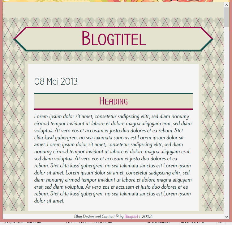
So wird unser Blog aussehen. Na ja, Container-mässig zumindest.
With these last steps our sketh is done. It should look like in the pircture I showed you before. And even if you resize your browser window it should still have the same ratio.
That's how our blog is gonna look like. Ar least contaienrwise.
Sobald das Bild kleiner als 900px ist, verschieben wir die Sidebar nach unten. Wir stretchen den Blog auf die ganze Breite, genauso machen wir's dann auch mit der Sidebar.
Dazu werden wir Google Drive verwenden, auf dem hosten wir diese beiden Stylesheets.
If you work on a responsive design it's always best to work from small to big. Which means we wanna start on the version for the small screen and then a version for a big screen. To change that we're gonna use two different stylesheets which apply each to a certain window size. One for everything under 900px and one for every size above.
As soon as the width is smaller than 900px, we're gonna move the sidebar to the bottom-part and stretch the blog to the full width of the container, because the sidebar wouldn't have enough space on a small window size. To host the stylesheets, we're gonna be using google drive.
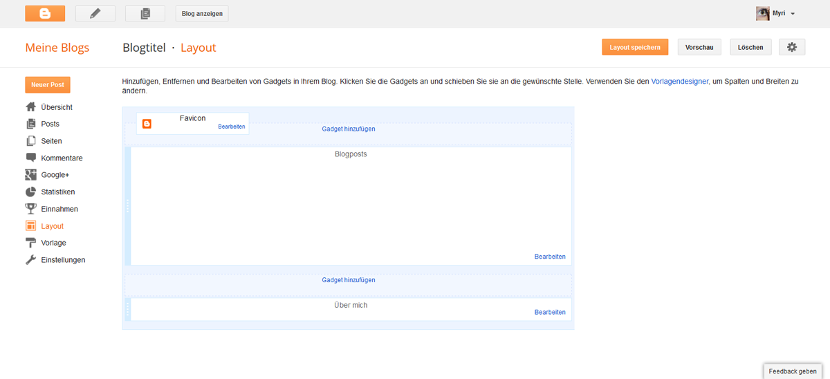
Um schonmal ein Style-Grundgerüst zu haben, habe ich die Bootstrap CSS eingebunden, sowie das JavaScript, um das responsive Menü einzubauen. Weiter sind Font Awesome und die Fonts drin, die ich in diesem Template verwenden will.
Ausserdem sind bereits die Grundgerüste für die beiden stylesheets drin. Das muss dann hochgeladen werden, sobald es fertig ist. Und dann habe ich bereits das Blogger-Gadget eingefügt. Und die Sidbar ist widgetized, das heisst, wir können Gadgets einfügen.
Unser Markup, sieht also folgendermassen aus:
Okay, we have our basic containers already done in HTML. In Blogger it does look a little more complex. There are certain things you can't leave out like for example the skin-tags. But actually you do have blogger messing with its own CSS in there so we're actually gonna place our own CSS in some style-tags.
Since I'm lazy I started already with some sort of CSS, which is the bootstrap one. It already gives your blog some style and you just have to adjust what you don't like by now. I also added bootstrap JavaScript for the responsive Top-Bar-Menu. In addition I linked font awesome and the google fonts I wanted to use in my final template.
Also there are the basic links made to our stylesheets for the different sizes, so you just have to add in the link as soon as it's hosted and done. And then I added the blogger widget. And I added the code to the sidebar which gives us the ability to place widgets in it.
Our basic layout looks like this:
Wir schreiben sie direkt in unseren Style-Bereich und sobald wir mit dem Ergebnis zufrieden sind, speichern wir unsere CSS als CSS-Datei.
Wenn wir uns das ganz ohne zusätzliche CSS ansehen (nur Bootstrap-CSS, also) dann schaut das so aus:
Okay, we paste this into a blog which already has some posts written. The blogger widget is gonna get filled with the whole code as soon as we save it. And then we're gonna start working on our CSS.
We're writing into our style-section and as soon as we like it we're saving it into a .css-document.
But right now, if you look at our blog without any additional CSS (only bootstrap) it looks like that:
Okay, wie gesagt, von klein zu gross. Und für klein soll unser Blog so aussehen:
Okay, from small to big. In the small version we want our blog to look like this:
Das wollen wir jetzt mit unserem Blog machen.
Bevor wir mit der CSS beginnen, müssen die noch leeren Container gefüllt werden, damit wir sie sehen.
So hat der Header einen Text bekommen, und die Sidebar ein Gadget.
And that's what we want to apply to our blog now.
But before we can do that, we have to fill our empty containers, so to see them.
I added a title to the header and a widget into our sidebar.
Okay, unser Blog schaut nun also so aus. (musst zwei Bilder machen, damit man alles sieht.
Our blog now looks like this.
CSS. Beginnen wir mit dem maincontainer. Der Code ist vorwiegend identisch wie unser Skizzen-Code es ist also wirklich einfach das zusammenzusetzen. 80% breit und mittig platziert. Damit wir das ganze aber auch noch sehen können, habe ich dem Body bereits eine Hintergrundfarbe gegeben, diese wird dann allerdings wieder entfernt.
CSS. Let's start with the main contaienr. The code mainly is identical to what we already wrote in our sketch, so it's really easy to put together. It's 80% width, centered. Just to be able to see it again, I did add a background color, which is gonna be removed again.
Unser Blog schaut nun so aus:
Now it looks like this:
Wir wollen jetzt nicht schon gestalten. Das heisst paddings etc, sowie allfällige Ränder oder anderes wollen wir noch nicht, jetzt geht es uns nur um den Aufbau. Es ist uns jetzt auch egal, dass die Navigation überdeckt wird, das machen wir später.
Als nächstes kommt der credit und den fixieren wir am unteren Rand.
We don't want to start styling right now. So no paddings or borders etc. Just placing everything were it's supposed to be. We don't care right now if our container hides part of our navigation, that's gonna be fixed later.
Now for the credit which is gonna be fixed to the bottom of the window.
Nun sieht's folgendermassen aus.
Looking like this.
Für den Header haben wir folgende CSS. Auch hier ist der Hintergrund nur da, um zu sehen, wo der container ist.
the header CSS looks like this. Here as well the background is only for us to actually see it.
Nun kommt der Content dran.
Now for the content
Und zum Schluss die Sidebar, die in diesem Fall mehr ein Footer ist. Da es sich um ein Design für kleine Bildschirme handelt, empfiehlt es sich nicht, den Footer irgendwie aufzuspalten, da die Breite sowieso nicht gross ist.
To finish it up the sidebar, which is more of a footer in that case. Since it is gonna be shown on small screens it wouldn't be very suitable to split it into sections or something like that. Just keep it simple.
Okay, jetzt machen wir unser Browser-Fenster mal noch klein.
Sieht alles noch richtig aus. :)
Okay, now let's resize our window
Everything still looking right :)
Das speichern wir nun in einer css-Datei, die wir narrow.css nennen. Einfach eine Datei auf dem Computer, damit es nicht verloren geht. Wir laden das jetzt noch nicht hoch, fertig sind wir ja noch nicht.
Bevor allerdings der tolle Teil losgeht, in dem wir gestalten, machen wir jetzt noch unser zweites Stylesheet bereit. Das für grosse Bildschirme, mit der Sidebar rechts.
That's what we're gonna save into our css-file. We call it narrow.css. Just save it to your computer at some place it's not gonna be lost. We're not uploading it yet, because we're not done.
Before the best part starts, we now prepare our second stylesheet. The one for the bigger screens.
Auch hier hilft euch der Code von der Skizze sehr beim Zusammenstellen der endgültigen CSS. Auf diese Weise ist sowas wirklich unglaublich schnell geschrieben.
Okay, gleich bleibt wie gesagt folgendes:
Okay, you have your narrow.css saved. Now go back to the blog editor and delete the css of the content and the sidebar. The rest is gonna be the same. Just like before our sketch CSS is helping putting it together.
That's the CSS we alredy have.
Und der veränderte Content und Sidebar-Code sieht folgendermassen aus:
And the new css for the content and sidebar looks like this:
Okay, nun, ich weiss nicht wie es euch geht, aber für mich ist es wichtig, dass es kompakt bleibt. Es gibt Riesengrosse Bildschirme. Man könnte das ganze jetzt so lassen, damit es auf jedem Bildschirm so aussieht, aber vor allem beim Header würde das schnell schlechter werden von der Qualität, da unser Bild sich ja mitstrecken soll. Wenn wir also einen Bildschrim haben, der eine Breite von 3000px hat, und die Breite unseres Contents sind 80%, dann müssten wir unser Header-Bild mit einer Breite von 2400px speichern, damit das Bild nicht vergrössert werden muss. Da wir das eigentlich nicht vor haben, definieren wir eine maximale Breite unseres Blogs. Bei mir liegt die bei 1200px, weil ich denke, dass man sein Headerbild in dieser Breite noch speichern kann und es mit einer für's Web gespeicherten Version auch nicht allzugrossen Speicherplatz gibt.
Unsere komplette CSS für wide.css lautet also mit maximaler Breite wie folgt:
I don't know about you, but for me it's important to stay compact. There are huge screens. You could just leave it like that, bu with a header it'd soon look pretty bad, because you can't save a picture with a width of 3000px or so, and it would loose a lot of quality while being stretched. So I likve adding a max-width, wich means the blog is not gonna stretch more than a certain kind of pixels. For me the best max-width is 1200px, which is what I'm gonna add.
Now that's what our wide.css looks like.
Speichert auch das in einer .css-Datei lokal auf dem Computer.
Save this as well in a css-file. Locally on your computer.
Jetzt haben wir eigentlich die grösste Arbeit schon gemacht. Die Basis steht. Was jetzt kommt ist das, was am meisten Spass macht, also freut euch drauf.
^^
Jetzt wird die Optik geplant.
And then it is already halfway done. You see a great sketch saves you a lot of time. If you make it seriously you only need to adjust it a little bit for the finished product.
The base is done. What comes now is space for creativity, my favourite, so look forward to this! :D
Now we plan our look.
Die Fonts habe ich bereits in dem Code eben eingebunden, da ich mich schon für die beiden entschieden hatte.
Yes, planning again. This time we plan the fonts, the colors, background and the header.
I already added the fonts to the blog, since I alreday decided before.
Meine Fonts sind beide seriffenlos und eher modern. Ich denke zwei Fonts sind perfekt. Einen für den Text und einen für die Headings. Drei sind auch okay, aber mehr als 4 wirken meiner Ansicht nach sehr schnell unharmonisch.
Both of my fonts are sans serif and on the modern side. I think two fonts are perfect. One for the text and one for the headings, three are okay as well but I really thing that more than 4 look very disharmonical and end up being chaotic.
For the colors I'd use 3 to 5 colors, not more or it'll end up too much. We aim for harmony.
#e3e3cf#960049#15524c
#d65ab9#a9d6ca
I'm going for a CSS-Background again. This means that it probably wont show on the mobile because most browsers do have some problems with CSS. For me it's okay, but if you think your background is very very important just use a picture instead. But I really like using as few images as possible since my blog is very slow-loading already.
For the header everyone can add his/her own image. However, I'm designing a template so I'm just gonna style my text with some kind of ribbon.
Hier würde ich zuerst allgemein stylen. Da wir zwei Stylesheets haben müssen wir uns überlegen, wo wir Unterschiede machen wollen und wo es keine Rolle spielt. Dinge wie der Hauptcontainer und der Header werden wahrscheinlich gleich aussehen, die Sidebar hat vielleicht Unterschiede.
Der Einfachheit halber, werden wir die Stylesheets auf ein Minimum reduzieren und alles gleich machen.
Das heisst, wir entfernen alle gestaltenden Attribute für beide Stylesheets
Having finished with the planning you can move on to the actual styling part.
First of all we have to remove every style character of the stylesheets. the look is gonna be the same, only the widht and position is gonna change, so we're adding all our style into our style-section and only link to our markup css.
The reduced stylesheet css looks like this now:
Eine davon lassen wir jetzt allerdings in unserem Blog drin, damit wir sehen, wie das ausschaut.
Okay, stylen wir :D
Wie immer schreibt ihr eure CSS jetzt selbst. Da ich hier ein Template für diejenigen gestalte, die kein eigenes schreiben wollen, gebe ich die CSS nach eigener Präferenz an. Aber eigentlich sind für diejenigen, die das selbst schreiben wollen einfach wichtig zu achten, dass ihr alle Punkte drin habt. :)
Da wir bereits die Bootstrap-CSS eingebunden haben, müssen wir nicht von 0 beginnen und auch nicht alles beschreiben, sondern nur das, was uns noch nicht gefällt :D
So schaut mein Template nach dem ersten Styling aus:
to be able to style it, you wanna copy one of those styles into your style-section. Just to be able to work on it. Then write your CSS.
As allways the CSS is up to you. I'm designing a template so I write whatever I like. For you it's probably not that interesting, but you can see what things I did change and which classes and ids you might need on your own project.
That's what my template looks like, after the basic styling.
Und die CSS ist folgende:
Für das Datum wende ich mein Datumstutorial an. Da es sich innerhalb des Blog-Widgets befindet verändert sich beim Vorgehen nichts (das ist grundsätzlich mit allen Tuts so. Verändern sie was im Blog-Widget selbst, bleibt alles gleich. :D) und dann passe ich die CSS nur noch nach meinen Wünschen an.
One of the things I like styling most is the date. I love thinking of new ways to showcase it.
I'm using my tutorial about the date (here) Since it's inside of the blog widget you can follow it without a problem (but it's german only, sorry. You might need a translator) And then just adjust the CSS to your own liking.

Das dieser Style auf kleinen Bildschirmen allerdings nicht so gut funktioniert, werde ich ihn anpassen. Das einzige, was dabei allerdings verändert wird, ist folgendes. (das kommt dann ebenfalls in unser narow-Stylesheet. Dazu aber gleich nochmal ein Roundup.
Since this style is not really usable in small screens I have to change it a little bit. Part of it is going into our style-sheet because it's gonna change. I'm showing you the complete CSS of the stylesheets in the end again.
Oliver hat ein tolles Tutorial zu den Kommentar-Bubbles gemacht, ich veränder das nur ein bisschen.
Ich suche als erstes nach
For the comments we're adding an icon-link instead of the classic links.
Oliver has written a comment and I'm partially following his tutorial (here)
First I search for
Das ist Teil eines Blocks der so aussieht:
That's part of a paragraph that looks like this:
Und beim zweiten Suchergebnis, füge ich vor dem schliessenden h3-Tag folgendes ein:
You'll find this twice. On the second one I'm gonna add the following before the closing h3-tag.
Der Block schaut also so aus:
The paragraph now looks like this:
Und dann die CSS:
And then CSS
Und aussehen tut's am Schluss so:
And the result of this:
Meine CSS ist diese
Next I'm gonna add numbered pages because I relly like them ^^ How this workes is explained here(sorry, just realized the original post I found doesn't exist any more. You need to work with my german version again...)
My CSS:
How to get a responsive menu has gotten an extra tutorial. Just create your own. I don't explain, just leave the link for ya. :D
Responsive TopBarmenu
Was wir jetzt machen, ist die Stylesheets zu speichern und diese Einzubinden. Und die CSS kommt zwischen die Style-Klammern.
Wie man ein Stylesheet hosted, seht ihr in diesem Tutorial hier
Und die Basislinks sind eigentlich schon vorhanden. Das einzige, was ihr tun müsst ist die links einfügen.
And Oh my God, we're almost done! :D
Now just save your stylesheets and host them. The CSS is placed in the style-section of our blog.
how to host a stylesheet is shwon here.
And basically you just have to add an URL.
And here's my CSS, between the style-tags
You don't really have to set it up. If it's working in your testblog it should work in other blogs as well. You can download and reload or just copy paste the code from editor to editor.
Ein responsived Template und dann ist alles wieder wie gehabt? Nein. So ganz stimmt das leider nicht.
Responsive müssen auch die Blogposts werden. Das heisst, wenn ihr einen Post mit Bildern schreibt, dann müssen diese Bilder responsiv gemacht werden.
Am einfachsten ist es, mit ein paar zusätzlichen Zeilen CSS. Da Blogger aber alle Bilder in der Verfassen-Ansicht einer Grösse anpasst, solltet ihr alle eure Bilder im HTML-Teil hochladen und dann die Originalgrösse, ohne Ausrichtung wählen. Dann lässt sich die CSS auch anwenden.
Congrats! You just wrote a responsive Template! Feels great, right?
A responsive template and now everythings's done. Not really. You do need to have responsive images as well. This means you have to remove every width and height definition of your post images and add the following CSS to your CSS.
Und jetzt müsst ihr mir alle eure selbst geschriebenen Templates zeigen, wenn ihr es probiert! Bei Fragen bin ich wie immer hier und ich beantworte so schnell wie möglich ^^
And now show me your selfwritten templates, if you try it! If there are any questions, just ask and I'll answer as fast as possible.
edit
Alle Anderen sind herzlich willkommen sich diesen überdimensionalen Post durzulesen. Aber das meiste davon ist eh nur Code, also nichts wovor man irgendwie eingeschüchtert sein sollte ^^
I've spent a lot of time thinking what special post I should write for my second blog birthday. I decided to a tutorial. It's on the trickier side. For the ones of you not even bothering how it's done but interested in a responsive blogger template, can click on this Link, which will bring you to the demo page, and instructions on how to customize it. Everyone interested in writing your own responsive blogger template is very welcome to read this post, which - sorry for that - has ended up being of quite some length. But most of it is code, so nothing to be frightened of ^^
Intro
Ein Blogger Blog Responsive hinkriegen. Nicht gerade das einfachste Unterfangen. Doch es ist machbar. Es erfordert ein eigenes Markup und sehr viel Geduld, aber es ist zu schaffen.Responsive, was bedeutet das überhaupt? Responsive bedeutet, dass sich die Seite der Grösse anpasst. Dass es also - egal ob auf dem PC, Tablet oder Handy - immer soweit funktioniert, dass nichts abgeschnitten wird. Es geht darum so benutzerfreundlich wie möglich zu sein. Und seien wir mal ehrlich, die mobilen Vorlagen von Blogger sind nicht wirklich etwas, was man sich gerne antut. Vor einer Weile (als die mobilen Aufrufe meines Blog auf fast 10% stiegen) habe ich mich zum ersten Mal wirklich mit responsivem Design auseinandergesetzt. Mir war schnell klar, dass das mit dem Blogger Markup nahezu unmöglich umzusetzen ist. Also habe ich mich kurzerhand dazu entschlossen das Markup selbst zu schreiben, und nur das Blog-Gadget zu übernehmen (ganz soweit, alles selbst zu schreiben, bin ich noch nicht, aber Oliver hat ne Serie dazu und am Ende werd ich's dann vielleicht schaffen ^^). Und weil responsive zu sein nun eines der grössten Ziele des Webdesigns ist, habe ich beschlossen ein Tutorial dazu zu machen.
Aber, ich muss es leider gestehen, das ist wirklich ein Tutorial, das nur diejenigen unter euch machen sollten, die sich mit HTML und CSS auskennen. Vor allem wenn ihr gerne Tutorials ausprobiert, müsst ihr euch darüber im Klaren sein, dass ihr alles was ausserhalb des Blog-Gadgets passiert, werdet umdenken müssen, da das ganze "Äussere" anders aussehen wird. Wir reduzieren die Unmengen an div-Containern. Wenn ihr mit dem Vorlagendesigner arbeiten wollt, ist es tonnenweise mehr Arbeit, und Blogger pfuscht dann in eurer CSS rum. Und da ich den Vorlagendesigner sowieso verabscheue, habe ich mich gar nicht erst mit den Variabeln auseinandergesetzt. Vorlagendesigner fällt also weg.
Ihr werdet alles im Editor machen, das heisst also, wenn ihr euch dort nicht wohl fühlt, lasst ihr es entweder nach dem Grundstyling noch etwas zu verändern oder ihr lasst es am liebsten ganz, mit dem responsiven Design, bis ihr soweit seid.
Aber ansonsten macht es total viel Spass. Ihr könnt dabei zusehen, wie aus einer Box-Skizze euer ganz persönliches Design manifestiert. Und es ist viel einfacher alles von Anfang an zu schreiben, als mit Grundmaterial Vorstellungen umsetzen zu wollen.
Und wenn ihr euch bei der Planung Mühe gebt, ist das Schreiben ein Kinderspiel.
Make a blogger blog responsive. Not the easiest task ever. But it's doable. It asks for its own markup and demands quite some time and pacience, but it is possible.
Responsive, what does that mean anyways? Responsive means that your webcontent adjusts to the size of the browser window, or mobile screen size. So your page adjusts to PC, tablet or mobile phone. The aim is to be as user-friendly as possible. And honestly, the mobile templates of blogger itself are horrible. Some time ago (as more and more people accessed my blog from mobile devices - nearing 10%) I first faced responsive desing and realized that it's impossible to create a responsive design with the markup blogger gives you. So I decided to write my own markup and only use the blog widget from blogger (not yet able to write that by myself, but I'm learning ^^) And because being responsive is currently one of the biggest aims of modern web design I decided to write a tutorial about it.
To be honest, this really is a demanding tutorial which only the ones with HTML and CSS skills should follow. You're not gonna use the templte designer and if you like trying out tutorials you will have to rethink everything that works outside of the blog widget.
If you don't feel comfortable in the editor, you should not do this.
But it's so much fun! You can see how it develops from a simple box sketch to a custom desing. And it's a lot easier to work out something personal if starting anew than messing around with already existing blogger code.
And if you really take the planning to heart writing it is a piece of cake.
Planning
Okay. Ein Teplate will geplant sein. Das gilt nicht nur für responsives Design sondern auch für alle anderen Templates. Wenn ihr keine Ahnung habt, wie es am Ende aussehen soll, dann ist das nicht gut.Als erstes empfiehlt es sich, für sich auf Papier eine Skizze zu machen. Eine Skizze bedeutet allerdings nicht ein Bidl des Headers zu zeichnen und sich in kleinen Details zu verlieren. Es geht darum in HTML zu denken, nicht in CSS, wenn ihr verteht was ich meine. Zeichnet euch die Container auf.
Und dann, wenn ihr diese Skizze habt, dann macht ihr euch eine "HTML-Skizze", in der ihr jeden Container mithilfe von CSS platziert.
Mein letztes Template sah in so einer Skizze folgendermassen aus:
Planning is the key to a positive outcome of this project. That rule doesn't apply to responsive design only but really any kind of webdesign. If you've got no idea what you wanna end up with, that's not good.
First of all you should draw a sketch of it on paper. With a sketh I don't mean a little picture of what it shall look like in the end. Don't loose yourself in details. You need the bases, so think in HTML, not CSS, if you get what I mean. Draw the containers. As soon as you've done that, you wanna transform this sketh into HTML and CSS. Make the divs into boxes and place them with CSS.
The sketch of my last template looks like this.
header
maincontainer
content
credit
Es handelt sich um responsives Design, also stellt sicher, dass ihr bereits hier alle Breiten in % angebt. Jetzt möchten wir aber unser responsives Design skizzieren. Meine Skizze sieht folgendermassen aus. Dieses Markup ist übrigens nicht nur das Markup von Argyle Creme sondern auch meines momentanen Templates und das von Responsive Simple. Ihr seht, dass man mit diesem Markup wirklich verschiedene Looks erstellen kann.
Since it's gonna be a responsive desing you wanna make sure that each width of your container is given in %, not pixels or anything else. Now we wanna sketch the template we're writing. It looks like this.
maincontainer
header
content
credit
Okay, wie ihr diese hinbekommt, das möchte ich mit euch jetzt durchgehen, denn das ist bereits eure Basis-CSS und ausserdem das Markup eures Blogs.
Wir machen das ganze mit simplem HTML. Ein Blogger-Blog wird in XHTML geschrieben, doch das Markup bleibt sich gleich.
Ihr öffnet ein neues Dokument und speichert es als .html-Datei ab. Wir werden kein separates Stylesheet einfügen. Da, es nur um eine Skizze geht.
Im HTML-Dokument schreibt ihr folgendes.
Okay. I'm gonna explain you how to achieve a sketh using this example. This sketh is actually our html markup and the base of our CSS.
We'll do our sketch with simple HTML even though a blogger template is written in XHTML, but the markup stays practically identical.
Open up your editor and a new document. Save it as a .html file. We're not gonna use a sepereate style-sheet, since it's only a sketch.
In your file, write the following.
<!DOCTYPE html>

<html lang="en">

 <head>

 </head>

 <body>

 </body>

</html>
Im body-Bereich werden unsere Container platziert. Diese sehen wie folgt aus:
We place our containers in the body-section. This will look something along those lines:
  <div id="nav">navbar</div>

  <div id="maincontainer"> maincontainer
   <div id="header">header</div>
   <div id="content">content</div>
   <div id="sidebar">sidebar</div>
   <div style="clear: both;" />
  </div>

  <div id="credit">credit</div>
Das gesamte Markup ist damit schon geschrieben. Als nächstes fügen wir style-Klammern hinzu, in die wir unsere CSS schreiben.
And that's basically our whole markup. Next we'll add some style-tags into which we're gonna add our CSS.
<!DOCTYPE html>

<html lang="en">

 <head>

 </head>

 <body>

  <style>
   <!-- CSS -->
  </style>

  <div id="nav">navbar</div>

  <div id="maincontainer"> maincontainer
   <div id="header">header</div>
   <div id="content">content</div>
   <div id="sidebar">sidebar</div>
   <div style="clear: both;" />
  </div>

  <div id="credit">credit</div>

 </body>

</html>
Die CSS für die Navbar, die Credits und den Container sind schnell geschrieben. Damit wir das ganze sehen können, definieren wir noch eine Hintergrundfarbe. Da es sich um praktisch leere Container handelt, geben wir auch Höhen an, beim eigentlichen Design werden wir dies nicht mehr tun müssen.
CSS for the navbar, credits and the container are written very fast. To be able to see the actual containers we're adding a background color and because they're practically empty we do add a height. We're not gonna that in the actuall template, because the containers are gonna adjust they height acoording to their content.
   #nav{
    width: 100%;
    height: 50px;
    background: #bbb;
    position: absolute;
    top: 0;
    left: 0;
   }

   #maincontainer{
    background: #ccc;
    width: 80%;
    position: absolute;
    top: 80px;
    left: 50%;
    margin-left: -40%;
    height: 650px;
   }

   #credit{
    width: 100%;
    background: #bbb;
    position: relative;
    bottom: 0;
    left: 0;
    height: 30px;
   }
Nachdem wir diese CSS hinzugefügt haben, sieht unsere Skizze so aus:
After this step our sketch looks like this:
Nun zum inneren Teil. Den Header platzieren wir oben und dann wollen wir die beiden anderen container nebeneinander haben. Um zwei container nebeneinander zu haben, müssen wir sie floaten. Da das allerdings das Konzept zerrüttet, muss der clear:both-Container sozusagen zwingendermassen noch im Markup enthalten sein, für all diejenigen, die sich schon gefragt haben.
Now for the part inside the container. We place the header on the top and want the second two next to each other right underneath it. To place to divs side by side we have to float them, even though you actually shouldn't use float, because it just destroys your whole concept, to fix it, we have to add the additionally clearfix-div-container.
   #header{
    background: #bbb;
    height: 150px;
    position: relative;
    width: 90%;
    top: 30px;
    left: 50%;
    margin-left: -45%;
   }

   #content{
    background: #bbb;
    width: 69%;
    position: relative;
    top: 50px;
    height: 400px;
    left: 5%;
    float: left;
   }

   #sidebar{
    width: 20%;
    background: #bbb;
    position: relative;
    top: 50px;
    height: 400px;
    right: 5%;
    float: right;
   }
Und damit ist unsere Skizze beendet. Sie sollte so aussehen, wie das Bild oben und auch bei verkleinertem Browserfenster noch genauso von den Verhältnissen sein.
So wird unser Blog aussehen. Na ja, Container-mässig zumindest.
With these last steps our sketh is done. It should look like in the pircture I showed you before. And even if you resize your browser window it should still have the same ratio.
That's how our blog is gonna look like. Ar least contaienrwise.
From Small to Big
Von klein zu gross. Wenn man an responsivem Desing arbeitet, dann muss man immer von klein nach gross arbeiten. Das heisst, dass man zuerst an der kleinen Version arbeitet und erst am Ende zu den grossen Bildschirmen kommt. Wollt ihr also wie ich es auf meinem Blog gemacht habe, drei verschiedene Designs (ich hab nur in der grossen Version eine Sidebar und der Header verändert sich immer) haben, dann arbeitet euch von der kleinen Version hoch. Bei mir sind dafür drei verschiedene Stylesheets eingebunden. Wir werden allerdings nur mit zweien arbeiten.Sobald das Bild kleiner als 900px ist, verschieben wir die Sidebar nach unten. Wir stretchen den Blog auf die ganze Breite, genauso machen wir's dann auch mit der Sidebar.
Dazu werden wir Google Drive verwenden, auf dem hosten wir diese beiden Stylesheets.
If you work on a responsive design it's always best to work from small to big. Which means we wanna start on the version for the small screen and then a version for a big screen. To change that we're gonna use two different stylesheets which apply each to a certain window size. One for everything under 900px and one for every size above.
As soon as the width is smaller than 900px, we're gonna move the sidebar to the bottom-part and stretch the blog to the full width of the container, because the sidebar wouldn't have enough space on a small window size. To host the stylesheets, we're gonna be using google drive.
Markup
Okay, das Grundgerüst haben wir schon in HTML gebaut. In Blogger schaut es noch etwas umständlicher aus. Das ganze muss xhtml sein, ausserdem gibt es gewisse Dinge, die man haben muss, wie die Skin-Tags, die allerdings jede CSS mit der blogger-eigenen versehen, also habe ich meine CSS ausserhalb davon in style-Klammern platziert.Um schonmal ein Style-Grundgerüst zu haben, habe ich die Bootstrap CSS eingebunden, sowie das JavaScript, um das responsive Menü einzubauen. Weiter sind Font Awesome und die Fonts drin, die ich in diesem Template verwenden will.
Ausserdem sind bereits die Grundgerüste für die beiden stylesheets drin. Das muss dann hochgeladen werden, sobald es fertig ist. Und dann habe ich bereits das Blogger-Gadget eingefügt. Und die Sidbar ist widgetized, das heisst, wir können Gadgets einfügen.
Unser Markup, sieht also folgendermassen aus:
Okay, we have our basic containers already done in HTML. In Blogger it does look a little more complex. There are certain things you can't leave out like for example the skin-tags. But actually you do have blogger messing with its own CSS in there so we're actually gonna place our own CSS in some style-tags.
Since I'm lazy I started already with some sort of CSS, which is the bootstrap one. It already gives your blog some style and you just have to adjust what you don't like by now. I also added bootstrap JavaScript for the responsive Top-Bar-Menu. In addition I linked font awesome and the google fonts I wanted to use in my final template.
Also there are the basic links made to our stylesheets for the different sizes, so you just have to add in the link as soon as it's hosted and done. And then I added the blogger widget. And I added the code to the sidebar which gives us the ability to place widgets in it.
Our basic layout looks like this:
<?xml version="1.0" encoding="UTF-8" ?>
<!DOCTYPE html>
<html xmlns='http://www.w3.org/1999/xhtml' xmlns:b='http://www.google.com/2005/gml/b' xmlns:data='http://www.google.com/2005/gml/data' xmlns:expr='http://www.google.com/2005/gml/expr'>
<head>
<title><data:blog.pageTitle/></title>
<!-- Bootstrap CSS -->
<link href='//netdna.bootstrapcdn.com/bootstrap/3.0.0-rc1/css/bootstrap.min.css' rel='stylesheet'/>
<!-- Narrow.css -->
<link href='narrow.css' media='screen and (max-width: 940px)' rel='stylesheet'/>
<!-- Wide.css -->
<link href='wide.css' media='screen and (min-width: 941px)' rel='stylesheet'/>
<!-- Font Awesome -->
<link href='//netdna.bootstrapcdn.com/font-awesome/3.2.1/css/font-awesome.css' rel='stylesheet'/>
<!-- Google Webfonts -->
<link href='http://fonts.googleapis.com/css?family=Bubbler+One' rel='stylesheet' type='text/css'/>
<link href='http://fonts.googleapis.com/css?family=Kite+One' rel='stylesheet' type='text/css' />
<!-- BLOGGER CSS PART (necessarry) -->
<b:skin><![CDATA[*/
]]></b:skin>
<style>
/* CSS, if undisturbed from Blogger desired
------------------------------------------------*/
</style>
</head>
<!-- JQuery -->
<script src='http://code.jquery.com/jquery-latest.min.js' type='text/javascript'/>
<!-- Bootstrap JavaScript -->
<script src='//netdna.bootstrapcdn.com/bootstrap/3.0.0-rc1/js/bootstrap.min.js'/>
<body>
<div class='navbar'> <!-- NAVIGATION MENU --> </div>
<div id='maincontainer'>
<div id='header'></div>
<div id='content'>
<b:section class='content' id='main' showaddelement='yes'>
<!-- Blog Widget -->
<b:widget id='Blog1' locked='false' title='Blogposts' type='Blog'>
</b:widget>
<!-- /Blog Widget -->
</b:section> <!-- /.content -->
</div> <!-- /#content -->
<div id='sidebar'>
<b:section class='sidebar' id='mysidebar' locked='false' showaddelement='yes'>
<!-- Sidebar Widgets -->
</b:section> <!-- /.sidebar -->
</div> <!-- /#sidebar -->
<div style='clear: both;'/>
</div> <!-- /#maincontainer -->
<div id='credit'>Blog Design and Content © by <a expr:href='data:blog.homepageUrl'><data:blog.title/></a> | 2013.</div>
<!-- </body> --> </body>
</html>Stylesheet 1: narrow.css
Okay, das kopieren wir nun in einen Blog, im den wir schon eine kleine Anzahl Posts haben. Das Blogger-Widget füllt sich dann automatisch. Und dann stellen wir die erste CSS zusammen.Wir schreiben sie direkt in unseren Style-Bereich und sobald wir mit dem Ergebnis zufrieden sind, speichern wir unsere CSS als CSS-Datei.
Wenn wir uns das ganz ohne zusätzliche CSS ansehen (nur Bootstrap-CSS, also) dann schaut das so aus:
Okay, we paste this into a blog which already has some posts written. The blogger widget is gonna get filled with the whole code as soon as we save it. And then we're gonna start working on our CSS.
We're writing into our style-section and as soon as we like it we're saving it into a .css-document.
But right now, if you look at our blog without any additional CSS (only bootstrap) it looks like that:
Okay, wie gesagt, von klein zu gross. Und für klein soll unser Blog so aussehen:
Okay, from small to big. In the small version we want our blog to look like this:
maincontainer
header
content
credit
Das wollen wir jetzt mit unserem Blog machen.
Bevor wir mit der CSS beginnen, müssen die noch leeren Container gefüllt werden, damit wir sie sehen.
So hat der Header einen Text bekommen, und die Sidebar ein Gadget.
And that's what we want to apply to our blog now.
But before we can do that, we have to fill our empty containers, so to see them.
I added a title to the header and a widget into our sidebar.
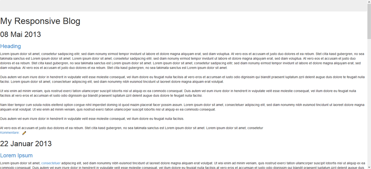
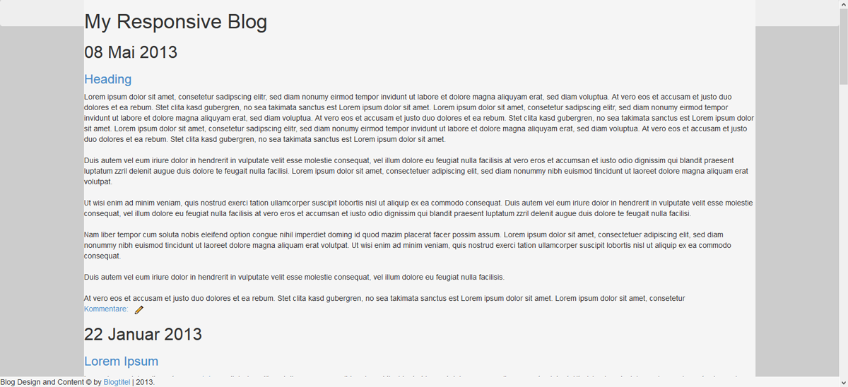
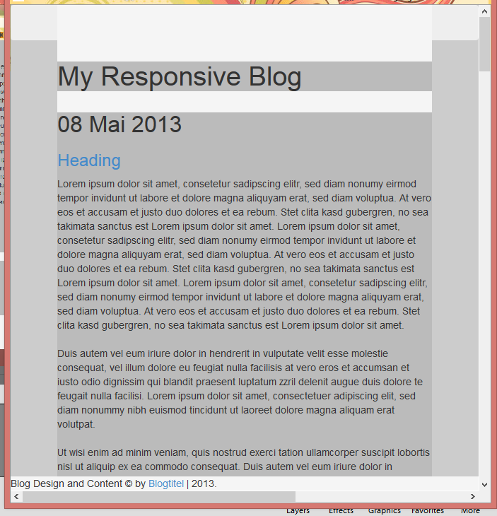
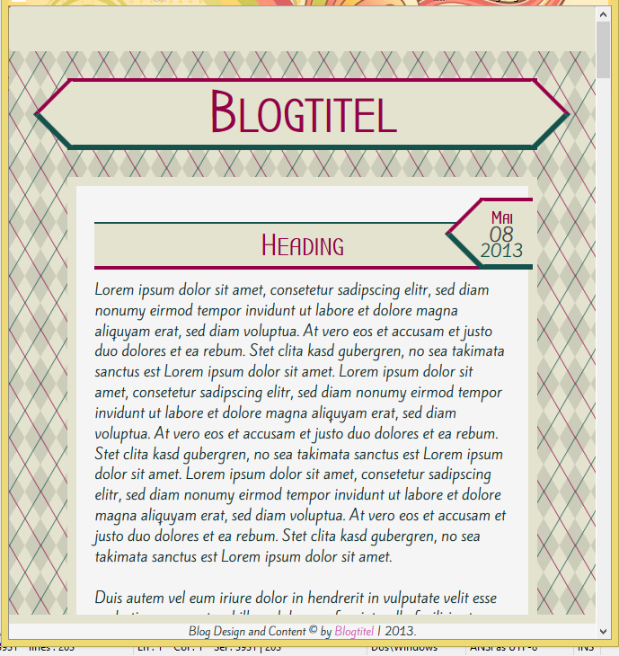
<div id='header'><h1>My Responsive Blog</h1></div>Okay, unser Blog schaut nun also so aus. (musst zwei Bilder machen, damit man alles sieht.
Our blog now looks like this.
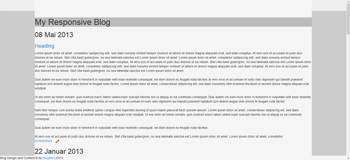
CSS. Beginnen wir mit dem maincontainer. Der Code ist vorwiegend identisch wie unser Skizzen-Code es ist also wirklich einfach das zusammenzusetzen. 80% breit und mittig platziert. Damit wir das ganze aber auch noch sehen können, habe ich dem Body bereits eine Hintergrundfarbe gegeben, diese wird dann allerdings wieder entfernt.
CSS. Let's start with the main contaienr. The code mainly is identical to what we already wrote in our sketch, so it's really easy to put together. It's 80% width, centered. Just to be able to see it again, I did add a background color, which is gonna be removed again.
body{
 background: #ccc;
}

#maincontainer{
 width: 80%;
 position: absolute;
 top: 0px;
 left: 50%;
 margin-left: -40%;
 background: #f5f5f5;
}
Unser Blog schaut nun so aus:
Now it looks like this:
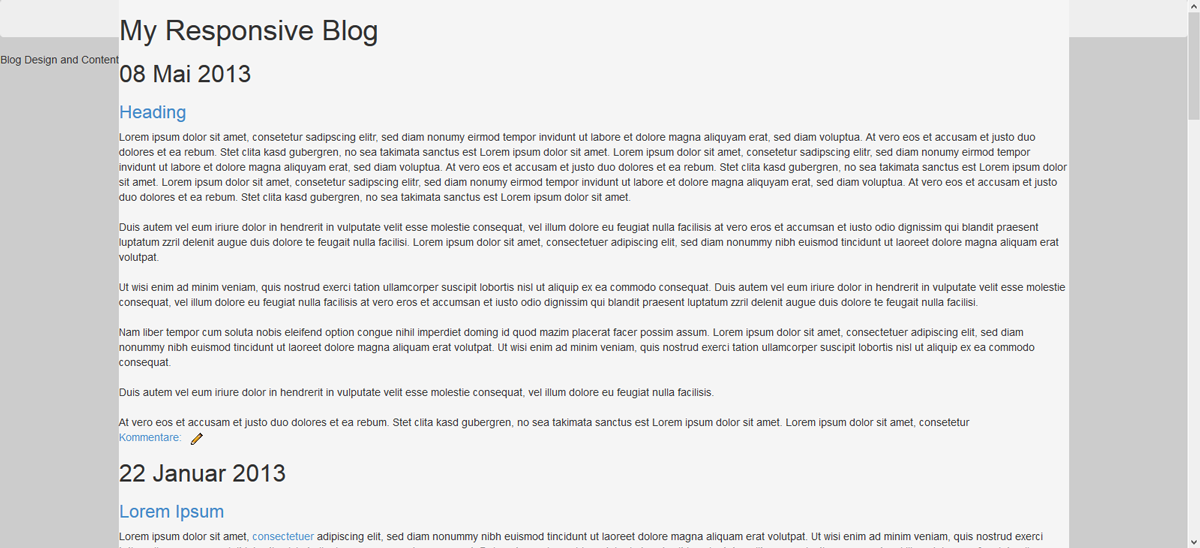
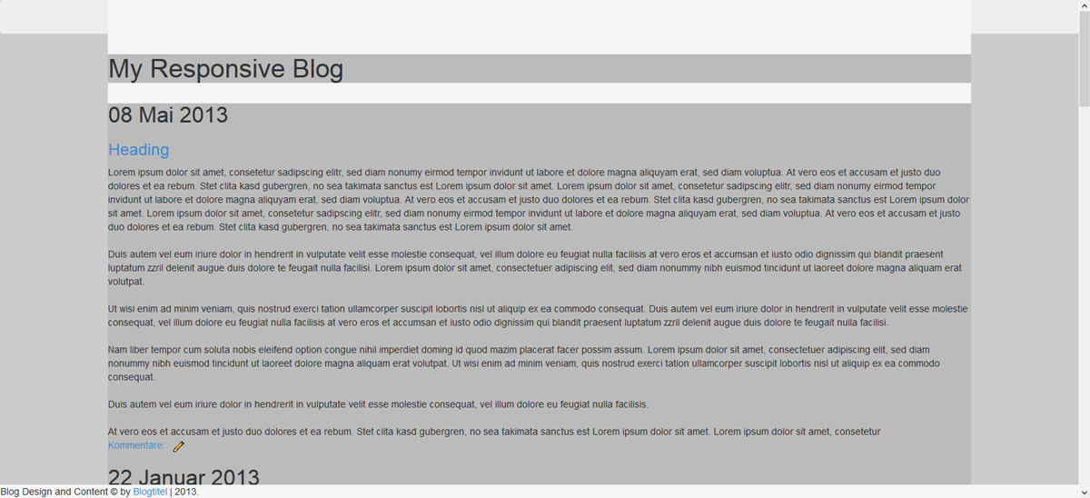
Wir wollen jetzt nicht schon gestalten. Das heisst paddings etc, sowie allfällige Ränder oder anderes wollen wir noch nicht, jetzt geht es uns nur um den Aufbau. Es ist uns jetzt auch egal, dass die Navigation überdeckt wird, das machen wir später.
Als nächstes kommt der credit und den fixieren wir am unteren Rand.
We don't want to start styling right now. So no paddings or borders etc. Just placing everything were it's supposed to be. We don't care right now if our container hides part of our navigation, that's gonna be fixed later.
Now for the credit which is gonna be fixed to the bottom of the window.
#credit{
 width: 100%;
 background: #f5f5f5;
 position: fixed;
        bottom: 0;
 left: 0;
}
Nun sieht's folgendermassen aus.
Looking like this.
Für den Header haben wir folgende CSS. Auch hier ist der Hintergrund nur da, um zu sehen, wo der container ist.
the header CSS looks like this. Here as well the background is only for us to actually see it.
#header{
 background: #bbb;
        margin-top: 80px;
 position: relative;
 width: 100%;
 top: 0px;
 left: 0;
}
Nun kommt der Content dran.
Now for the content
#content{
 background: #bbb;
 width: 100%;
 margin-top: 30px;
 position: relative;
 top: 0;
 left: 0;
}
Und zum Schluss die Sidebar, die in diesem Fall mehr ein Footer ist. Da es sich um ein Design für kleine Bildschirme handelt, empfiehlt es sich nicht, den Footer irgendwie aufzuspalten, da die Breite sowieso nicht gross ist.
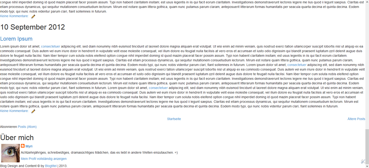
To finish it up the sidebar, which is more of a footer in that case. Since it is gonna be shown on small screens it wouldn't be very suitable to split it into sections or something like that. Just keep it simple.
#sidebar{
 background: #bbb;
 width: 100%;
 margin-top: 15px;
 position: relative;
 top: 0;
 left: 0;
        margin-bottom: 80px;
}
Okay, jetzt machen wir unser Browser-Fenster mal noch klein.
Sieht alles noch richtig aus. :)
Okay, now let's resize our window
Everything still looking right :)
Das speichern wir nun in einer css-Datei, die wir narrow.css nennen. Einfach eine Datei auf dem Computer, damit es nicht verloren geht. Wir laden das jetzt noch nicht hoch, fertig sind wir ja noch nicht.
Bevor allerdings der tolle Teil losgeht, in dem wir gestalten, machen wir jetzt noch unser zweites Stylesheet bereit. Das für grosse Bildschirme, mit der Sidebar rechts.
That's what we're gonna save into our css-file. We call it narrow.css. Just save it to your computer at some place it's not gonna be lost. We're not uploading it yet, because we're not done.
Before the best part starts, we now prepare our second stylesheet. The one for the bigger screens.
Stylesheet 2: wide.css
Wie gesagt, ihr speichert eure erste CSS in der Datei ab. Jetzt löschen wir die CSS für den Content und die Sidebar im Blog drin. Den rest übernehmen wir von der ersten CSS.Auch hier hilft euch der Code von der Skizze sehr beim Zusammenstellen der endgültigen CSS. Auf diese Weise ist sowas wirklich unglaublich schnell geschrieben.
Okay, gleich bleibt wie gesagt folgendes:
Okay, you have your narrow.css saved. Now go back to the blog editor and delete the css of the content and the sidebar. The rest is gonna be the same. Just like before our sketch CSS is helping putting it together.
That's the CSS we alredy have.
body{
 background: #ccc;
}

#maincontainer{
 width: 80%;
 position: absolute;
 top: 0px;
 left: 50%;
 margin-left: -40%;
 background: #f5f5f5;
}

#credit{
 width: 100%;
 background: #f5f5f5;
 position: fixed;
    bottom: 0;
 left: 0;
}

#header{
 background: #bbb;
    margin-top: 80px;
 position: relative;
 width: 100%;
 top: 0px;
 left: 0;
}
Und der veränderte Content und Sidebar-Code sieht folgendermassen aus:
And the new css for the content and sidebar looks like this:
#content{
 background: #bbb;
 width: 77%;
 margin-top: 30px;
 position: relative;
 left: 0;
 float: left;
 margin-bottom: 80px;
}

#sidebar{
 background: #bbb;
 width: 20%;
 margin-top: 30px;
 position: relative;
 right: 0;
 float: right;
}
Okay, nun, ich weiss nicht wie es euch geht, aber für mich ist es wichtig, dass es kompakt bleibt. Es gibt Riesengrosse Bildschirme. Man könnte das ganze jetzt so lassen, damit es auf jedem Bildschirm so aussieht, aber vor allem beim Header würde das schnell schlechter werden von der Qualität, da unser Bild sich ja mitstrecken soll. Wenn wir also einen Bildschrim haben, der eine Breite von 3000px hat, und die Breite unseres Contents sind 80%, dann müssten wir unser Header-Bild mit einer Breite von 2400px speichern, damit das Bild nicht vergrössert werden muss. Da wir das eigentlich nicht vor haben, definieren wir eine maximale Breite unseres Blogs. Bei mir liegt die bei 1200px, weil ich denke, dass man sein Headerbild in dieser Breite noch speichern kann und es mit einer für's Web gespeicherten Version auch nicht allzugrossen Speicherplatz gibt.
Unsere komplette CSS für wide.css lautet also mit maximaler Breite wie folgt:
I don't know about you, but for me it's important to stay compact. There are huge screens. You could just leave it like that, bu with a header it'd soon look pretty bad, because you can't save a picture with a width of 3000px or so, and it would loose a lot of quality while being stretched. So I likve adding a max-width, wich means the blog is not gonna stretch more than a certain kind of pixels. For me the best max-width is 1200px, which is what I'm gonna add.
Now that's what our wide.css looks like.
body{
 background: #ccc;
}

#maincontainer{
 width: 80%;
 max-width: 1200px;
 position: absolute;
 top: 0px;
 left: 50%;
 margin-left: -40%;
 background: #f5f5f5;
}

#credit{
 width: 100%;
 background: #f5f5f5;
 position: fixed;
    bottom: 0;
 left: 0;
}

#header{
 background: #bbb;
    margin-top: 80px;
 position: relative;
 width: 100%;
 top: 0px;
 left: 0;
}

#content{
 background: #bbb;
 width: 77%;
 margin-top: 30px;
 position: relative;
 left: 0;
 float: left;
 margin-bottom: 80px;
}

#sidebar{
 background: #bbb;
 width: 20%;
 margin-top: 30px;
 position: relative;
 right: 0;
 float: right;
}
Speichert auch das in einer .css-Datei lokal auf dem Computer.
Save this as well in a css-file. Locally on your computer.
Basic is done
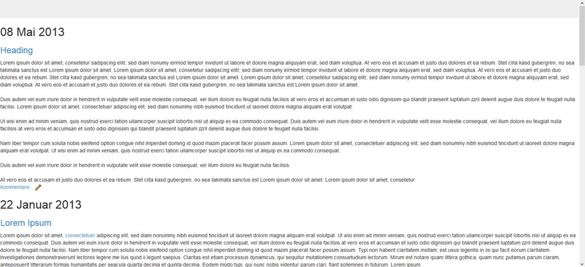
Und damit ist es tatsächlich schon soweit. Ihr seht, eine gute Skizze ist schon die halbe Miete. Wenn ihr die Skizze ernsthaft gemacht habt, also gecoded und nicht schnell mit Photoshop zusammengesetzt, dann ist es sehr leicht die Blogger-Version zu schreiben.Jetzt haben wir eigentlich die grösste Arbeit schon gemacht. Die Basis steht. Was jetzt kommt ist das, was am meisten Spass macht, also freut euch drauf.
^^
Jetzt wird die Optik geplant.
And then it is already halfway done. You see a great sketch saves you a lot of time. If you make it seriously you only need to adjust it a little bit for the finished product.
The base is done. What comes now is space for creativity, my favourite, so look forward to this! :D
Now we plan our look.
Style-Planning
Ja, auch wieder Planung. Und zwar planen wir jetzt die Fonts, die Farben, den Hintergrund und den Header.Die Fonts habe ich bereits in dem Code eben eingebunden, da ich mich schon für die beiden entschieden hatte.
Yes, planning again. This time we plan the fonts, the colors, background and the header.
I already added the fonts to the blog, since I alreday decided before.
Fonts
Bubbler One(Headings) + Kite OneMeine Fonts sind beide seriffenlos und eher modern. Ich denke zwei Fonts sind perfekt. Einen für den Text und einen für die Headings. Drei sind auch okay, aber mehr als 4 wirken meiner Ansicht nach sehr schnell unharmonisch.
Both of my fonts are sans serif and on the modern side. I think two fonts are perfect. One for the text and one for the headings, three are okay as well but I really thing that more than 4 look very disharmonical and end up being chaotic.
Colors
Für die Farben empfehlen sich drei bis fünf Hauptfarben, sonst wird's meiner Meinung nach schnell etwas viel.For the colors I'd use 3 to 5 colors, not more or it'll end up too much. We aim for harmony.
#e3e3cf#960049#15524c
#d65ab9#a9d6ca
Background
Beim Hintergrund werde ich wieder einen CSS-Hintergrund wählen. Dies bedeutet aber, dass es nicht auf jeden Fall angezeigt wird, in gewissen mobilen Browsern funktionieren die CSS-Patterns nicht immer. Für mich ist das okay, bei Mobilen Designs geht meistens die Optik etwas flöten, also spielt es nicht wirklich eine Rolle für mich. Wenn ihr das allerdings nicht wollt, dann entscheidet euch lieber für ein Bild. Aber ich verwende gerne so wenig Bilder wie möglich allgemein. Meine Seite lädt mir eh schon nicht schnell genung. ^^I'm going for a CSS-Background again. This means that it probably wont show on the mobile because most browsers do have some problems with CSS. For me it's okay, but if you think your background is very very important just use a picture instead. But I really like using as few images as possible since my blog is very slow-loading already.
background-color: #e3e3cf;
background-image:
repeating-linear-gradient(120deg, rgba(21, 82, 76, .7), rgba(21, 82, 76, .7) 1px, transparent 1px, transparent 30px),
repeating-linear-gradient(60deg, rgba(150, 0, 73, .7), rgba(150, 0, 73, .7) 1px, transparent 1px, transparent 30px),
linear-gradient(60deg, rgba(0,0,0,.1) 25%, transparent 25%, transparent 75%, rgba(0,0,0,.1) 75%, rgba(0,0,0,.1)),
linear-gradient(120deg, rgba(0,0,0,.1) 25%, transparent 25%, transparent 75%, rgba(0,0,0,.1) 75%, rgba(0,0,0,.1));
background-size: 35px 60px;
Header
Zum Header kann hier natürlich jeder sein Bild einbinden. Da ich allerdings ein Template gestalte, habe ich hier keinen direkten Header, sondern ich werde eine Art Ribbon gestalten.For the header everyone can add his/her own image. However, I'm designing a template so I'm just gonna style my text with some kind of ribbon.
Styling
Okay, habt ihr das soweit, könnt ihr mit dem eigentlichen Stylen anfangen.Hier würde ich zuerst allgemein stylen. Da wir zwei Stylesheets haben müssen wir uns überlegen, wo wir Unterschiede machen wollen und wo es keine Rolle spielt. Dinge wie der Hauptcontainer und der Header werden wahrscheinlich gleich aussehen, die Sidebar hat vielleicht Unterschiede.
Der Einfachheit halber, werden wir die Stylesheets auf ein Minimum reduzieren und alles gleich machen.
Das heisst, wir entfernen alle gestaltenden Attribute für beide Stylesheets
Having finished with the planning you can move on to the actual styling part.
First of all we have to remove every style character of the stylesheets. the look is gonna be the same, only the widht and position is gonna change, so we're adding all our style into our style-section and only link to our markup css.
The reduced stylesheet css looks like this now:
narrow.css
#maincontainer{
 width: 80%;
 position: absolute;
 top: 0px;
 left: 50%;
 margin-left: -40%;
}

#credit{
 width: 100%;
 position: fixed;
    bottom: 0;
 left: 0;
}

#header{
    margin-top: 80px;
 position: relative;
 width: 100%;
 top: 0px;
 left: 0;
}

#content{
 width: 100%;
 margin-top: 30px;
 position: relative;
 top: 0;
 left: 0;
}

#sidebar{
 width: 100%;
 margin-top: 15px;
 position: relative;
 top: 0;
 left: 0;
    margin-bottom: 80px;
}
wide.css
#maincontainer{
 width: 80%;
 max-width: 1200px;
 position: absolute;
 top: 0px;
 left: 50%;
 margin-left: -40%;
}

#credit{
 width: 100%;
 position: fixed;
    bottom: 0;
 left: 0;
}

#header{
    margin-top: 80px;
 position: relative;
 width: 100%;
 top: 0px;
 left: 0;
}

#content{
 width: 77%;
 margin-top: 30px;
 position: relative;
 left: 0;
 float: left;
 margin-bottom: 80px;
}

#sidebar{
 width: 20%;
 margin-top: 30px;
 position: relative;
 right: 0;
 float: right;
}
Eine davon lassen wir jetzt allerdings in unserem Blog drin, damit wir sehen, wie das ausschaut.
Okay, stylen wir :D
Wie immer schreibt ihr eure CSS jetzt selbst. Da ich hier ein Template für diejenigen gestalte, die kein eigenes schreiben wollen, gebe ich die CSS nach eigener Präferenz an. Aber eigentlich sind für diejenigen, die das selbst schreiben wollen einfach wichtig zu achten, dass ihr alle Punkte drin habt. :)
Da wir bereits die Bootstrap-CSS eingebunden haben, müssen wir nicht von 0 beginnen und auch nicht alles beschreiben, sondern nur das, was uns noch nicht gefällt :D
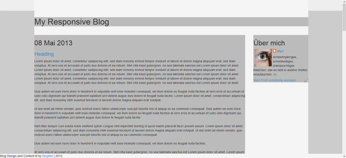
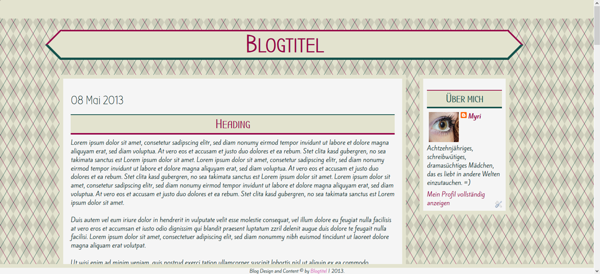
So schaut mein Template nach dem ersten Styling aus:
to be able to style it, you wanna copy one of those styles into your style-section. Just to be able to work on it. Then write your CSS.
As allways the CSS is up to you. I'm designing a template so I write whatever I like. For you it's probably not that interesting, but you can see what things I did change and which classes and ids you might need on your own project.
That's what my template looks like, after the basic styling.
Und die CSS ist folgende:
/* Basic Style
-------------------------------*/
body{
 background: fixed;
 background-color: #e3e3cf;
 background-image:
  repeating-linear-gradient(120deg, rgba(21, 82, 76, .7), rgba(21, 82, 76, .7) 1px, transparent 1px, transparent 30px),
  repeating-linear-gradient(60deg, rgba(150, 0, 73, .7), rgba(150, 0, 73, .7) 1px, transparent 1px, transparent 30px),
  linear-gradient(60deg, rgba(0,0,0,.1) 25%, transparent 25%, transparent 75%, rgba(0,0,0,.1) 75%, rgba(0,0,0,.1)),
  linear-gradient(120deg, rgba(0,0,0,.1) 25%, transparent 25%, transparent 75%, rgba(0,0,0,.1) 75%, rgba(0,0,0,.1));
 background-size: 35px 60px;
 font-family: Kite One, Sans Serif;
 font-size: 16px;
 color: #0D302D;
}

.navbar{
 z-index: 20;
 background: #e3e3cf;
}

#maincontainer{
 background: transparent;
}

#credit{
 background: #f5f5f5;
 border-top: 10px solid #e3e3cf;
 font-size: 12px;
 text-align: center;
}

#header{
 font-family: Bubbler One, Sans Serif;
}

#hader h1 a, #header h1 a:visited{
 color: #960049;
}

   #header h1 a:hover{
     color: #15524c;
}

#header h1{
 width: 100%;
 background: #e3e3cf;
 font-size: 65px;
 font-weight: bold;
 font-variant: small-caps;
 text-align: center;
 position: relative;
 height: 80px;
 line-height: 70px;
    border-radius: 3px;
 border-top: 4px solid #960049;
    border-bottom: 6px solid #15524c;
}

#header h1:before{
 content:'';
 position: absolute;
 width: 51px;
 height: 51px;
    background: #e3e3cf;
 left: -26px;
 top: 7px;
 transform: rotate(45deg);
 border-left: 4px solid #960049;
    border-bottom: 6px solid #15524c;
}

#header h1:after{
 content:'';
 position: absolute;
 width: 51px;
 height: 51px;
    background: #e3e3cf;
 right: -26px;
 top: 8px;
 transform: rotate(45deg);
 border-top: 4px solid #960049;
    border-right: 6px solid #15524c;
}


#content{
 background: #f5f5f5;
 border: 10px solid #e3e3cf;
 padding: 20px;
 overflow: auto;
}

#sidebar .widget{
 border: solid 10px #e3e3cf;
 background: #f5f5f5;
 padding: 10px;
 width: 100%;
    margin-bottom: 15px;
}

h1, h2, h3, h4, h5{
 font-family: Bubbler One;
}

a:link{
 text-decoration: none;
 color: #960049;
}

a:visited{
 text-decoration: none;
 color: #d65ab9;
}

a:hover{
 color: #15524c;
 font-variant: small-caps;
}

h3.post-title{
 background: #e3e3cf;
 font-family: Bubbler One;
 color: #15524c;
 width: 100%;
 font-variant: small-caps;
 font-weight: bold;
 font-size: 34px;
 text-align: center;
 border-top: 2px solid #15524c;
 border-bottom: 4px solid #960049;
 padding: 5px;
}

#sidebar .widget h2{
 background: #e3e3cf;
 text-align: center;
 border-bottom: 4px solid #15524c;
 border-top: 2px solid #960049;
 padding: 5px;
 color: #15524c;
 font-variant: small-caps;
 font-size: 30px;
 font-weight: bold;
}

.feed-links {
 display:none !important;
}
Date
Okay. Eines der Dinge, die ich am liebsten style ist das Datum. Ich liebe es, mir neue Wege zu überlegen, wie man es gestalten könnte.Für das Datum wende ich mein Datumstutorial an. Da es sich innerhalb des Blog-Widgets befindet verändert sich beim Vorgehen nichts (das ist grundsätzlich mit allen Tuts so. Verändern sie was im Blog-Widget selbst, bleibt alles gleich. :D) und dann passe ich die CSS nur noch nach meinen Wünschen an.
One of the things I like styling most is the date. I love thinking of new ways to showcase it.
I'm using my tutorial about the date (here) Since it's inside of the blog widget you can follow it without a problem (but it's german only, sorry. You might need a translator) And then just adjust the CSS to your own liking.

/* Date styling */
span.date-header{
    position: absolute;
    left: -65px;
    text-align: center; /*Text zentriert*/
    font-size: 17px; /*Schriftfarbe wenn nicht anders definiert*/
    color: rgba(255,255,255,.8);
}

#date{
    display:block; /*Blockanzeige*/
    text-align:center; /*Zentrierter Text*/
    background: #e3e3cf;
    height: 80px;
    border-top: 4px solid #960049;
    border-bottom: 6px solid #15524c;
    position: relative;
    z-index: -1;
}

#date:before{
    content:'';
    position: absolute;
    width: 51px;
    height: 51px;
    background: #e3e3cf;
    left: -27px;
    top: 7px;
    transform: rotate(45deg);
    border-left: 4px solid #960049;
    border-bottom: 6px solid #15524c;
}

.month{
    margin-top: 5px;
    font-size: 20px;
    color: #960049;
    position: relative;
    z-index: 4;
    margin-bottom: -5px;
    font-family: Bubbler One;
    font-variant: small-caps;
    font-weight: bold;
    padding-right: 10px;
}

.day{
    margin-top: -10px;
    font-size: 20px;
    color: #444;
    position: relative;
    z-index: 4;
    padding-right: 10px;
}

.year{
    margin-top: -10px;
    font-size: 18px;
    color: #15524c;
    position: relative;
    z-index: 4;
    padding-right: 10px;
}
Das dieser Style auf kleinen Bildschirmen allerdings nicht so gut funktioniert, werde ich ihn anpassen. Das einzige, was dabei allerdings verändert wird, ist folgendes. (das kommt dann ebenfalls in unser narow-Stylesheet. Dazu aber gleich nochmal ein Roundup.
Since this style is not really usable in small screens I have to change it a little bit. Part of it is going into our style-sheet because it's gonna change. I'm showing you the complete CSS of the stylesheets in the end again.
span.date-header{
    position: absolute;
    right: -5px;
    margin-top: -27px;
    text-align: center; /*Text zentriert*/
    font-size: 17px; /*Schriftfarbe wenn nicht anders definiert*/
    color: rgba(255,255,255,.8);
}
Comments
Für die Kommentare machen wir anstelle des klassischen Links, einfach einen icon-Link.Oliver hat ein tolles Tutorial zu den Kommentar-Bubbles gemacht, ich veränder das nur ein bisschen.
Ich suche als erstes nach
For the comments we're adding an icon-link instead of the classic links.
Oliver has written a comment and I'm partially following his tutorial (here)
First I search for
<b:if cond='data:post.title'>
      <h3 class='post-title entry-title' itemprop='name'>
Das ist Teil eines Blocks der so aussieht:
That's part of a paragraph that looks like this:
    <b:if cond='data:post.title'>
      <h3 class='post-title entry-title' itemprop='name'>
      <b:if cond='data:post.link'>
        <a expr:href='data:post.link'><data:post.title/></a>
      <b:else/>
        <b:if cond='data:post.url'>
          <b:if cond='data:blog.url != data:post.url'>
            <a expr:href='data:post.url'><data:post.title/></a>
          <b:else/>
            <data:post.title/>
          </b:if>
        <b:else/>
          <data:post.title/>
        </b:if>
      </b:if>
      </h3>
    </b:if>
Und beim zweiten Suchergebnis, füge ich vor dem schliessenden h3-Tag folgendes ein:
You'll find this twice. On the second one I'm gonna add the following before the closing h3-tag.
<!-- comment bubble -->
<b:if cond='data:blog.pageType == "index"'>
<a class='bubble' expr:href='data:post.url + "#comments"'><i class="icon-comments-alt"></i></a>
</b:if>Der Block schaut also so aus:
The paragraph now looks like this:
<b:if cond='data:post.title'>
<h3 class='post-title entry-title' itemprop='name'>
<b:if cond='data:post.link'>
<a expr:href='data:post.link'><data:post.title/></a>
<b:else/>
<b:if cond='data:post.url'>
<b:if cond='data:blog.url != data:post.url'>
<a expr:href='data:post.url'><data:post.title/></a>
<b:else/>
<data:post.title/>
</b:if>
<b:else/>
<data:post.title/>
</b:if>
</b:if>
<!-- comment bubble -->
<b:if cond='data:blog.pageType == "index"'>
<a class='bubble' expr:href='data:post.url + "#comments"'><i class="icon-comments-alt"></i></a>
</b:if>
</h3>
</b:if>
Und dann die CSS:
And then CSS
/* Comment Style */
.comment-link {
display: none;
}
.bubble {
position: relative;
top: -3px;
right: 0px;
}
.bubble:visited{
color: #960049;
}
.bubble:hover{
color: #15524c;
}
.bubble i{
background: rgba(255, 255, 255, .25);
border-radius: 50em;
font-size: 24px;
width: 35px;
height: 35px;
padding: 7px;
margin-bottom: 3px;
line-height: 30px;
border: 3px solid #15524c;
}
.bubble i:hover{
border: 3px solid #960049;
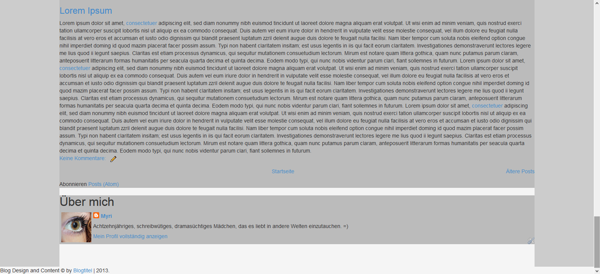
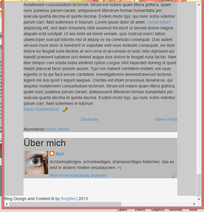
}Und aussehen tut's am Schluss so:
And the result of this:
Pages
Okay, als nächstes kommen nummerierte Seiten rein, weil mir das einfach besser gefällt. Wie das geht, hab ich hier schon erklärt.Meine CSS ist diese
Next I'm gonna add numbered pages because I relly like them ^^ How this workes is explained here(sorry, just realized the original post I found doesn't exist any more. You need to work with my german version again...)
My CSS:
/* Numbered Pages */
.pagenavi{
 clear:both;
 margin:10px auto;
 text-align:center
}

.pagenavi span,.pagenavi a{
 padding:10px;
 margin-right:5px;
 padding-top:5px;
 padding-bottom:5px;
 background: #960049;
 color: #fff;
}

.pagenavi a:hover,.pagenavi .current{
 background:#15524c;
 color:#fff;
 text-decoration:none
}
.pagenavi .pages{
 display: none;
}

.pagenavi .pages{
 border:none
}
Menu
Wie ihr ein responsives Menu macht, hab ich euch auch schon gezeigt. Auf diese Weise stellt ihr es ganz nach eurem Geschmack zusammen. Ich erklär das jetzt also nicht, sondern lass einfach den Link da.How to get a responsive menu has gotten an extra tutorial. Just create your own. I don't explain, just leave the link for ya. :D
Responsive TopBarmenu
Stylesheets narrow and wide
Und Oh mein Gott, dann sind wir schon fast am Ende angelangt! :DWas wir jetzt machen, ist die Stylesheets zu speichern und diese Einzubinden. Und die CSS kommt zwischen die Style-Klammern.
Wie man ein Stylesheet hosted, seht ihr in diesem Tutorial hier
Und die Basislinks sind eigentlich schon vorhanden. Das einzige, was ihr tun müsst ist die links einfügen.
And Oh my God, we're almost done! :D
Now just save your stylesheets and host them. The CSS is placed in the style-section of our blog.
how to host a stylesheet is shwon here.
And basically you just have to add an URL.
Narrow.css
Okay, hier die komplette narrow CSS/* NARROW.CSS
-------------------------------*/
#maincontainer{
width: 80%;
position: absolute;
top: 0px;
left: 50%;
margin-left: -40%;
}
#credit{
width: 100%;
position: fixed;
bottom: 0;
left: 0;
}
#header{
margin-top: 80px;
position: relative;
width: 100%;
top: 0px;
left: 0;
}
#content{
width: 100%;
margin-top: 30px;
position: relative;
top: 0;
left: 0;
}
#sidebar{
width: 100%;
margin-top: 15px;
position: relative;
top: 0;
left: 0;
margin-bottom: 80px;
}
/* DATE STYLING */
span.date-header{
position: absolute;
right: -5px;
margin-top: -27px;
text-align: center; /*Text zentriert*/
font-size: 17px; /*Schriftfarbe wenn nicht anders definiert*/
color: rgba(255,255,255,.8);
}Wide.css
Und hier die komplette wide CSS/* WIDE.CSS
-------------------------------*/
#maincontainer{
width: 80%;
max-width: 1200px;
position: absolute;
top: 0px;
left: 50%;
margin-left: -40%;
}
#credit{
width: 100%;
position: fixed;
bottom: 0;
left: 0;
}
#header{
margin-top: 80px;
position: relative;
width: 100%;
top: 0px;
left: 0;
}
#content{
width: 77%;
margin-top: 30px;
position: relative;
left: 0;
float: left;
margin-bottom: 80px;
}
#sidebar{
width: 20%;
margin-top: 30px;
position: relative;
right: 0;
float: right;
}
/* DATE STYLING */
span.date-header{
position: absolute;
left: -65px;
text-align: center; /*Text zentriert*/
font-size: 17px; /*Schriftfarbe wenn nicht anders definiert*/
color: rgba(255,255,255,.8);
}
#date{
z-index: -1;
}Basic CSS
Und dann noch alles, was zwischen die Style-Klammern kommtAnd here's my CSS, between the style-tags
/* Basic Style
-------------------------------*/
body{
 background: fixed;
 background-color: #e3e3cf;
 background-image:
  repeating-linear-gradient(120deg, rgba(21, 82, 76, .7), rgba(21, 82, 76, .7) 1px, transparent 1px, transparent 30px),
  repeating-linear-gradient(60deg, rgba(150, 0, 73, .7), rgba(150, 0, 73, .7) 1px, transparent 1px, transparent 30px),
  linear-gradient(60deg, rgba(0,0,0,.1) 25%, transparent 25%, transparent 75%, rgba(0,0,0,.1) 75%, rgba(0,0,0,.1)),
  linear-gradient(120deg, rgba(0,0,0,.1) 25%, transparent 25%, transparent 75%, rgba(0,0,0,.1) 75%, rgba(0,0,0,.1));
 background-size: 35px 60px;
 font-family: Kite One, Sans Serif;
 font-size: 16px;
 color: #0D302D;
}

#maincontainer{
 background: transparent;
}

#credit{
 background: #f5f5f5;
 border-top: 10px solid #e3e3cf;
 font-size: 12px;
 text-align: center;
}

#header{
 font-family: Bubbler One, Sans Serif;
}

#hader h1 a, #header h1 a:visited{
 color: #960049;
}

   #header h1 a:hover{
     color: #15524c;
}

#header h1{
 width: 100%;
 background: #e3e3cf;
 font-size: 65px;
 font-weight: bold;
 font-variant: small-caps;
 text-align: center;
 position: relative;
 height: 80px;
 line-height: 70px;
 border-top: 4px solid #960049;
    border-bottom: 6px solid #15524c;
}

#header h1:before{
 content:'';
 position: absolute;
 width: 51px;
 height: 51px;
    background: #e3e3cf;
 left: -26px;
 top: 7px;
 transform: rotate(45deg);
 border-left: 4px solid #960049;
    border-bottom: 6px solid #15524c;
}

#header h1:after{
 content:'';
 position: absolute;
 width: 51px;
 height: 51px;
    background: #e3e3cf;
 right: -26px;
 top: 8px;
 transform: rotate(45deg);
 border-top: 4px solid #960049;
    border-right: 6px solid #15524c;
}


#content{
 background: #f5f5f5;
 border: 10px solid #e3e3cf;
 padding: 20px;
}

#sidebar .widget{
 border: solid 10px #e3e3cf;
 background: #f5f5f5;
 padding: 10px;
 width: 100%;
    margin-bottom: 15px;
}

h1, h2, h3, h4, h5{
 font-family: Bubbler One;
}

a:link{
 text-decoration: none;
 color: #960049;
}

a:visited{
 text-decoration: none;
 color: #d65ab9;
}

a:hover{
 color: #15524c;
 font-variant: small-caps;
}

h3.post-title{
 background: #e3e3cf;
 font-family: Bubbler One;
 color: #15524c;
 width: 100%;
 font-variant: small-caps;
 font-weight: bold;
 font-size: 34px;
 text-align: center;
 border-top: 2px solid #15524c;
 border-bottom: 4px solid #960049;
 padding: 5px;
}

#sidebar .widget h2{
 background: #e3e3cf;
 text-align: center;
 border-bottom: 4px solid #15524c;
 border-top: 2px solid #960049;
 padding: 5px;
 color: #15524c;
 font-variant: small-caps;
 font-size: 30px;
 font-weight: bold;
}

.feed-links {
 display:none !important;
}

/* Date styling  (span date header in stylesheets) */

#date{
 display:block; /*Blockanzeige*/
 text-align:center; /*Zentrierter Text*/
 background: #e3e3cf;
 height: 80px;
 border-top: 4px solid #960049;
    border-bottom: 6px solid #15524c;
 position: relative;
}

#date:before{
 content:'';
 position: absolute;
 width: 51px;
 height: 51px;
    background: #e3e3cf;
 left: -27px;
 top: 7px;
 transform: rotate(45deg);
 border-left: 4px solid #960049;
    border-bottom: 6px solid #15524c;
}

.month{
    margin-top: 5px;
 font-size: 20px;
 color: #960049;
    position: relative;
    z-index: 4;
    margin-bottom: -5px;
 font-family: Bubbler One;
    font-variant: small-caps;
    font-weight: bold;
 padding-right: 10px;
}

.day{
    margin-top: -10px;
 font-size: 20px;
 color: #444;
    position: relative;
    z-index: 4;
 padding-right: 10px;
}

.year{
    margin-top: -10px;
 font-size: 18px;
 color: #15524c;
    position: relative;
    z-index: 4;
 padding-right: 10px;
}

/* Comment Style */
.comment-link {
 display: none;
}

.bubble {
  position: relative;
  top: -3px;
  right: 0px;
}

.bubble:visited{
 color: #960049;
}

.bubble:hover{
 color: #15524c;
}
.bubble i{
 background: rgba(255, 255, 255, .25);
 border-radius: 50em;
 font-size: 24px;
 width: 35px;
 height: 35px;
 padding: 7px;
 margin-bottom: 3px;
 line-height: 30px;
 border: 3px solid #15524c;
}

.bubble i:hover{
 border: 3px solid #960049;
}

/* Numbered Pages */
.pagenavi{
 clear:both;
 margin:10px auto;
 text-align:center
}

.pagenavi span,.pagenavi a{
 padding:10px;
 margin-right:5px;
 padding-top:5px;
 padding-bottom:5px;
 background: #960049;
 color: #fff;
}

.pagenavi a:hover,.pagenavi .current{
 background:#15524c;
 color:#fff;
 text-decoration:none
}
.pagenavi .pages{
 display: none;
}

.pagenavi .pages{
 border:none
}

/* Navbar Style */
.navbar{
 -webkit-box-shadow:  0px 2px 2px 1px rgba(0, 0, 0, .4);
 box-shadow:  0px 2px 2px 1px rgba(0, 0, 0, .4);
 z-index: 20;
 background: #e3e3cf;
}

.navbar li a:hover{
 border: 0;
 background: #15524c;
 font-variant: normal;
 color: #fff;
}

.navbar li a{
 color: #444;
}

.dropdown-menu li a:hover{
 background: #960049 !important;
 color: #fff;
}

.dropdown-menu{
 border-radius: 0 !important;
}

.navbar input:focus{
 box-shadow: none;
 -webkit-box-shadow: none;
 -moz-box-shadow: none;
}

.navbar-search {
    position: relative;
 margin-top: 5px;
}

.navbar-search .form-control{
 border-radius: 0 !important;
 background: #f5f5f5;
 font-family: Kite One;
}

.navbar-search .form-control:focus{
 border: 0;
 color: #444;
}

.cse-search-box:hover, .cse-search-box:focus, .navbar-search .form-control:hover, .navbar-search:hover{
 color: #15524c;
}

.navbar-search .search-query {
 padding-left: 29px !important;
}

.navbar-search .icon-search {
    position: absolute;
    top: 11px;
    left: 11px;
}
Set Up
Okay. Gross was zum Set Up gibt es nicht. Wenn es in eurem Testblog läuft, sollte es auch irgendwo anders laufen. Ihr könnt es runterladen und dann hochladen, oder einfach direkt von Editor zu Editor kopieren.You don't really have to set it up. If it's working in your testblog it should work in other blogs as well. You can download and reload or just copy paste the code from editor to editor.
Done? - Responsive Blogposts
Gratuliere! Ihr habt das erste responsive Template geschrieben! Fühlt sich toll an, oder?Ein responsived Template und dann ist alles wieder wie gehabt? Nein. So ganz stimmt das leider nicht.
Responsive müssen auch die Blogposts werden. Das heisst, wenn ihr einen Post mit Bildern schreibt, dann müssen diese Bilder responsiv gemacht werden.
Am einfachsten ist es, mit ein paar zusätzlichen Zeilen CSS. Da Blogger aber alle Bilder in der Verfassen-Ansicht einer Grösse anpasst, solltet ihr alle eure Bilder im HTML-Teil hochladen und dann die Originalgrösse, ohne Ausrichtung wählen. Dann lässt sich die CSS auch anwenden.
Congrats! You just wrote a responsive Template! Feels great, right?
A responsive template and now everythings's done. Not really. You do need to have responsive images as well. This means you have to remove every width and height definition of your post images and add the following CSS to your CSS.
img {
 display: block;
 max-width: 100%;
}
Und jetzt müsst ihr mir alle eure selbst geschriebenen Templates zeigen, wenn ihr es probiert! Bei Fragen bin ich wie immer hier und ich beantworte so schnell wie möglich ^^
And now show me your selfwritten templates, if you try it! If there are any questions, just ask and I'll answer as fast as possible.
Heads Up! Puh. Es ist endlich geschafft. Die letzten Tage habe ich an diesem Post und dem zugehörigen Template gebastelt. Total waren's über 48 Stunden und deswegen würd ich mich jetzt natürlich ganz besonders über Kommentare freuen. Hat sich der Aufwand gelohnt? Tutorial brauchbar? Template brauchbar? Über Feedback freu ich mich immer :D
Heads Up! It is finally done. I've been working on this post and template over the last few days. It was over 48 hours of time and that's why I'd be grateful for any kind of feedback. Do you think it was worth the effort? Tutorial useful? Template useful? Write a comment!
16 comments:
Fragen, Feedback oder anderes, was du loswerden willst?
Kommentiere über das alte Kommentarsystem (check wieder vorbei um zu sehen, ob ich geantwortet habe) oder G+
Questiosn, Feedback or something else you want to tell me?
Comment using the old system or G+ and make sure to check back to see if I answered
wow :)
ReplyDeleteIch wusste gar nicht, das sowas geht...
Jetzt werde ich wohl erstmal mehrere Abende am Design basteln, ganz zufrieden war ich eh nie.
Der Tutorial ist wirklich toll, ich glaube, dass es selbst Anfänger (wie ich) gebrauchen können :)
Danke und liebe Grüße
Aww, das freut mich :) Danke dir!
DeleteSo, ich habe das mal ausprobiert:
Deletehttp://tubbyleins-licht-blick.blogspot.de/
Aber ich habe ein riesiges Problem:
Mein Archiv besteht aus vielen Bilder, die alle 120px breit sind. Eigentlich gehören 5 Bilder nebeneinander, aber jetzt sind sie alle untereinander. Kannst du mir sagen, wie ich die wieder normal bekomme?
Liebe Grüße
Hmmm... wie hast du die denn nebeneinander platziert? Also mit was für Code?
DeleteHab eine Lösung gefunden :)
Deletemit
ReplyDelete<a href="Post" target="_blank" title="posttitel"><img src="Bildlink"></a>
und dann ohne Leerzeichen dahinter das gleiche für die anderen Bilder.
Versuch mal dieses Tutorial. Damit solltest du die Bilder wieder nebeneinander kriegen.
ReplyDeleteDu hättest dir wirklich keine Sorgen machen müssen, dass dieser Post von niemandem gelesen wird. Wirklich super interessant! Ich finde das immer sehr schwierig. Dieser Post hat mir jetzt etwas geholfen, aber dennoch ist das nicht so wie Ich wollte. Hättest du vielleicht Zeit, mir zu helfen, dass mein Template/Design responsive wird? Wenn du Lust bzw. Zeit hast, kannst du mir ja eine Mail schicken oder eine Nachricht via Blogosphera. :) xx
ReplyDeleteHi. Ich hab das mal ausprobiert, klappt eigentlich super. - Ich habe die Narrow und wide CSS weggelassen.
ReplyDeleteIch habe nur ein Problem: Meine Sidebar schwirrt immer noch unter meinen Postbereich rum. :o Was kann man da machen?
Ja, das passiert wenn man die narrow und wide css weglässt...
DeleteDie bestimmen deine ganze Base.
Hast du gefloated?
Hab alles wieder hinbekommen. Mir ist aufgefallen,dass wenn man den Text in Posts auf justify setzt er über den Postbereich hinausläuft. Was kann man da unternehmen?
ReplyDeleteBeispiel: http://richtigesblogdesign.blogspot.de/
...Und wie kann man die Lightbox einfügen?
ReplyDeleteoverflow: auto.
ReplyDeleteFunktioniert die denn nicht? K.P. ...
Vielen Dank. :)
DeleteUm die Lightbox einzufügen muss man einfach nur ein Script in die XML Datei einfügen. :)
DeleteYeah! Ich hab grad wirklich ein Template geschrieben. Jetzt muss ich es irgendwnan noch einbauen.
ReplyDeleteGanz lieben Dank für die Anleitung :)