[GIMP] Cutout Images[CSS] ✤✤✤
Hallo zusammen :)
Heute möchte ich euch zeigen, wie ihr "Coutout Images" in Gimp erstellt und dann in euren Blog einfügt. Als Cutout Image bezeichne ich Bilder, die so aussehen, als wären sie ausgeschnitten worden. Das heisst in eurem Blog-Container habt ihr ein "Loch", das euren Hintergrund durchscheinen lässt.
Um das ganze zu verbildlichen, habe ich ein Demo geschrieben.
Hello Everyone :)
Today I want to show you how to create and implement cutout images in your blog. I call them cutout because that's what it looks liks. Inside of your container you'll have an image cut out. I wrote a demo so you can see the effect.
Demo
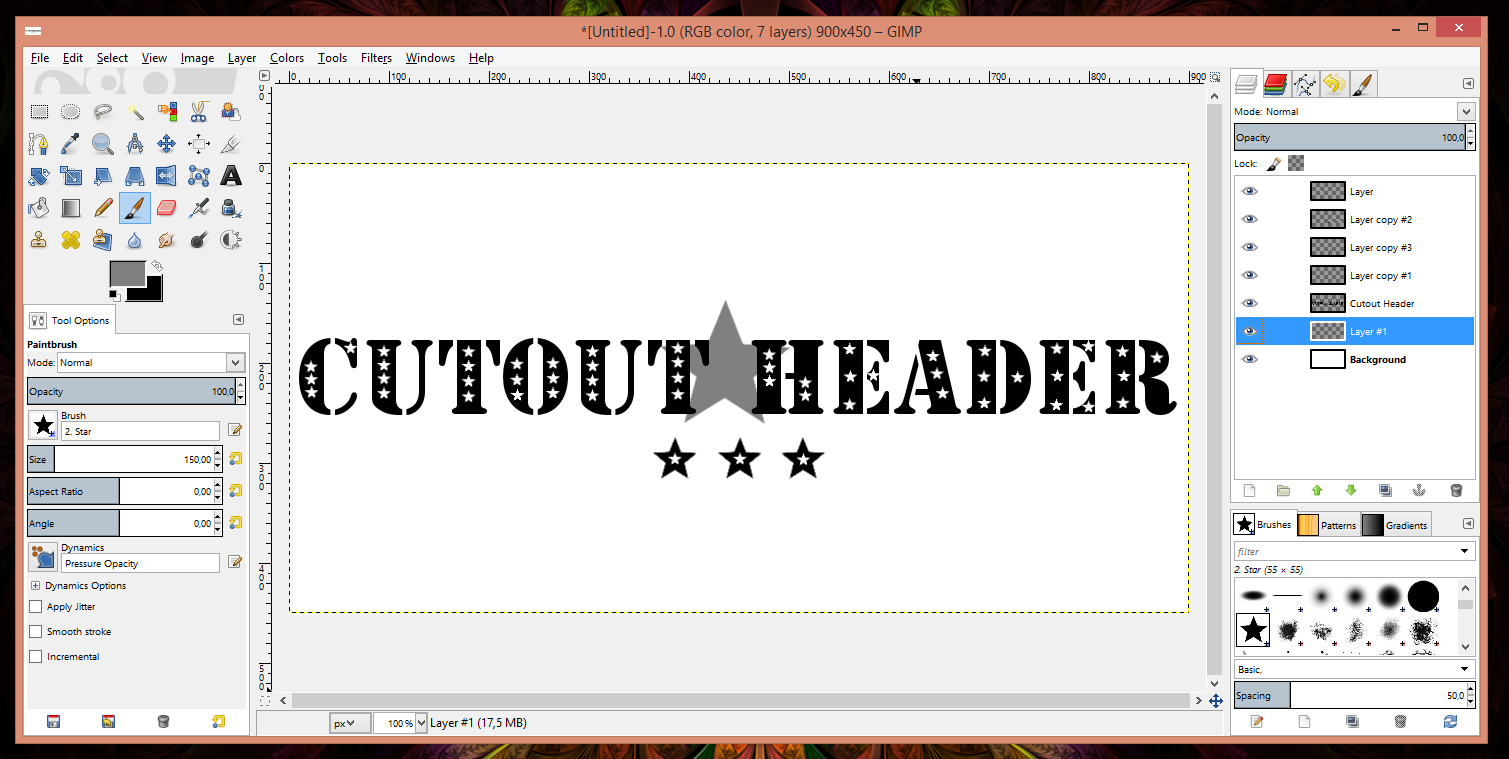
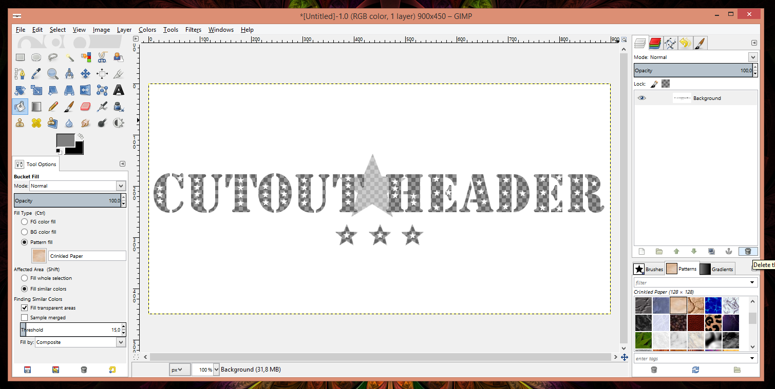
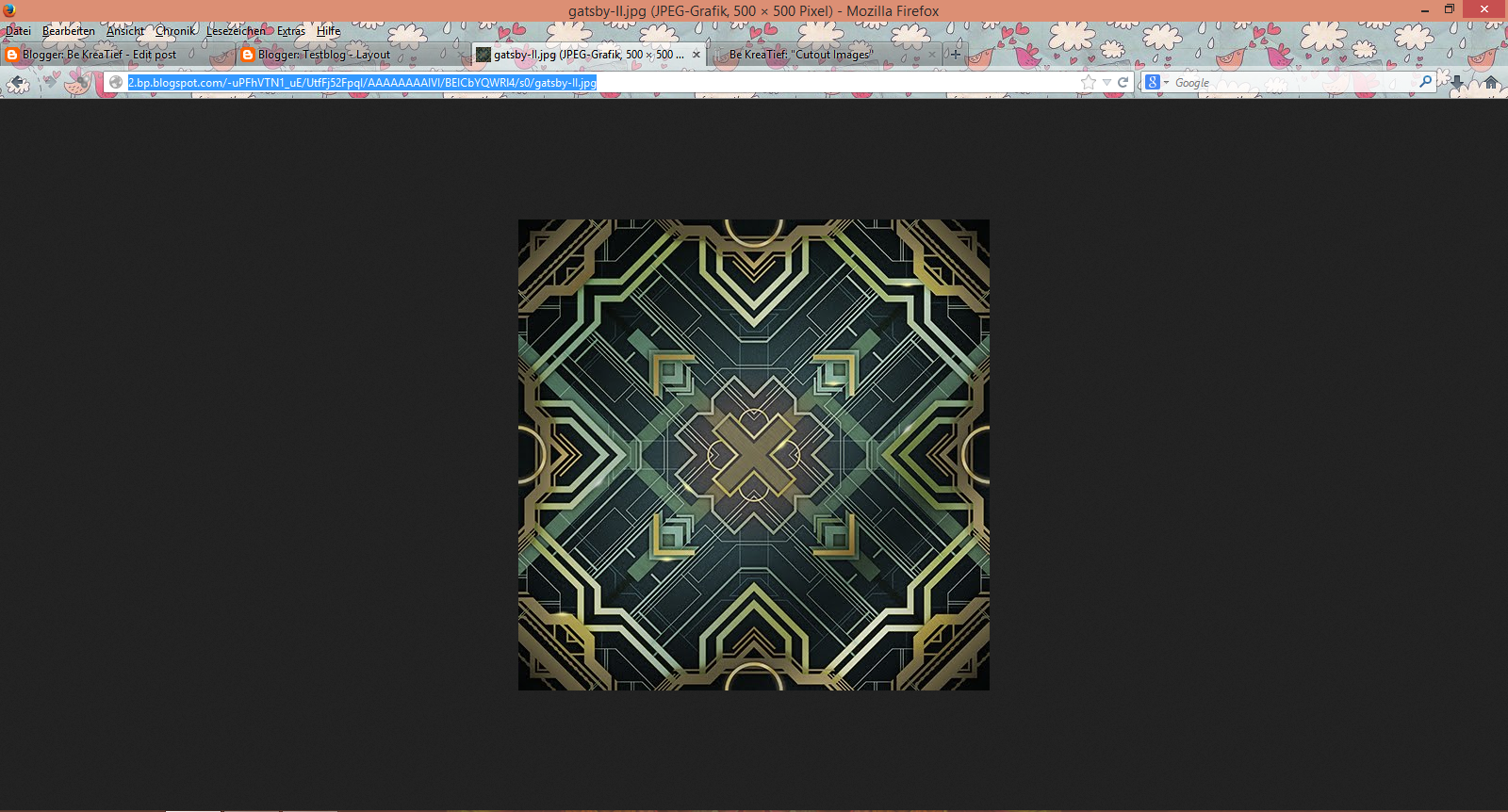
Dann schreibt, zeichnet, erstellt ihr euer Bild, das ausgeschnitten werden soll. Das ganze macht ihr in Schwarz auf weissem Hintergrund (wenn euer Container-Hintergrund weiss ist) Wenn ihr gewisse Details nur halbtransparent haben wollt, dann verwendet ihr grau. Alles was sichtbar bleiben soll, bleibt weiss.
Für mich sah das dann so aus:
Okay, to create something like this, open up gimp and create a new image.
Then write, draw, create the image that you want to cut out. You are going to do this using black on white (if white is the background of your container). If you wish for some details to be just semi-transparent, use gray. Everything that should remain visible, stays white.
That's what it looked like for me:
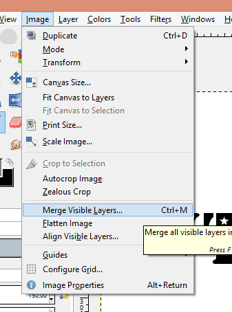
Ich habe das ganze noch auf verschiedenen Ebenen gehabt, damit ich damit experimentieren soll, aber schlussendlich wollen wir nur eine Ebene haben, also müssen wir sie alle zusammenlegen.
Das macht ihr mit Image -> Merge Visible Layers
I had it all on different layers because I find it easier if I can move every element around. But in the end we need one layer. So we need to merge them. Choose Image -> Merge Visible Layers
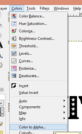
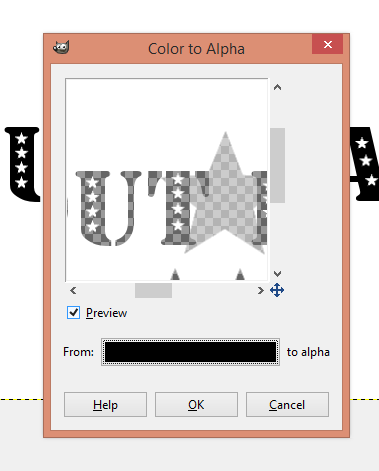
Eine einzige Ebene bleibt übrig. Jetzt wird das ganze ausgeschnitten. ^^
Geht zu Color -> Color to Alpha und wählt dann schwarz als zu entfernende Farbe aus.
Alles was schwarz war, wird transparent.
A single layer is left. Now we cut out. ^^
Go to Color -> Colot to Alpha and choose black as the color to be removed.
Everything that was black is now transparent.
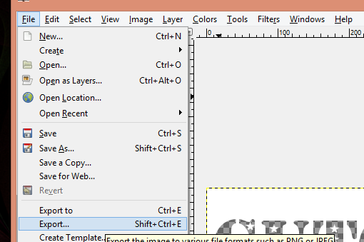
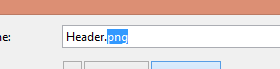
Wenn ihr wollt, schneidet das Bild noch zurecht und dann könnt ihr es exportieren. Stellt sicher, dass ihr euer Bild als .png-Datei speichert.
If you want to, cut the image and then you are ready to export. Make sure you save your image as a .png-file.
Und dann seid ihr ready um das ganze hochzuladen :)
And then we are ready to upload.
Okay, we upload it now. I'm using my Minima Responsive Template for this example. If you want to use it in a different layout you may need to add a little more CSS.
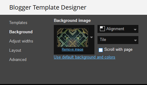
Im Vorlagendesigner entfernt ihr einfach das Häkchen, dass der Hintergrund nicht mitscrollen soll.
For the effect to look best I'd fix the background. You can do this either in the template designer or directly inside the code.
In the template designer just remove the tick for the background to not scroll.
Ansonsten fügt ihr einfach eine Zeile CSS bei body hinzu:
Otherwise just add this line to your body-CSS.
Und damit der Container nicht so oben am Rand klebt, könnt ihr noch einen Rand hinzufügen. Dazu einfach nach folgender CSS suchen:
And so that the container does not stick to the top, you can add a margin by searching the following CSS
Und bei der letzten Zeile das 0 von margin durch einen Wert ersetzen, der euch optisch gefällt. Ich habe mich für 100px entschieden, die dann oberhalb und unterhalb des Containers angezeigt werden.
Meine Zeile lautet also:
And replacing the 0 in margin with the number you like best. for me it was 100px and my finished line looks like this:
Jetzt können wir das Bild einfügen.
Now we can add the image
Open up the header widget and upload the image making sure to make he same adjustments I did. Then save.
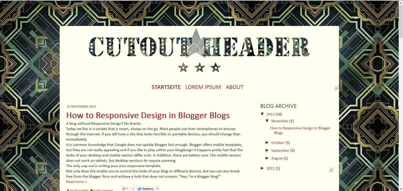
Aussehen tut das ganze dann so:
I will look like this:
Genau, man kann gar nichts sehen. Das ändern wir nun mit etwas CSS.
Als erstes brauchen wir den Link unseres Hintergrundes. Das könnt ihr entweder im Code suchen, oder aber ihr lasst euch über Rechtsklick auf den Bloghintergrund das Bild anzeigen und könnt die URL aus der Adresszeile kopieren. Speichert euch die URL irgendwo ab.
Exactly, you can't see anything. We'll change that with a little bit of CSS.
First you need the link of your backgkround. YOu can check in the code or just rightclick on the background, grab the image and get the link there. Save this URL somewhere.
Gut, jetzt kommen wir zur CSS, die wir einfügen.
Die könnt ihr über den Vorlagendesigner hinzufügen, oder im Code.
Ich mache es im Code.
Dazu sucht ihr nach:
Okay, now for the CSS. you can add it in the template desinger or in the code. That's what I'm gonna do.
Search for:
Oberhalb davon fügt ihr folgendes ein. Das Bild wird mit diesem Code gleich noch zentriert. Falls ihr das nicht wollt, entfernt einfach die margin-Zeile.
Above that put the following. This CSS does center the header at the same time. If you don't want that, just remove the margin-line.
Speichern und der Cutout-Effekt ist fertig. :)
Save and the cutout-effect is done :)
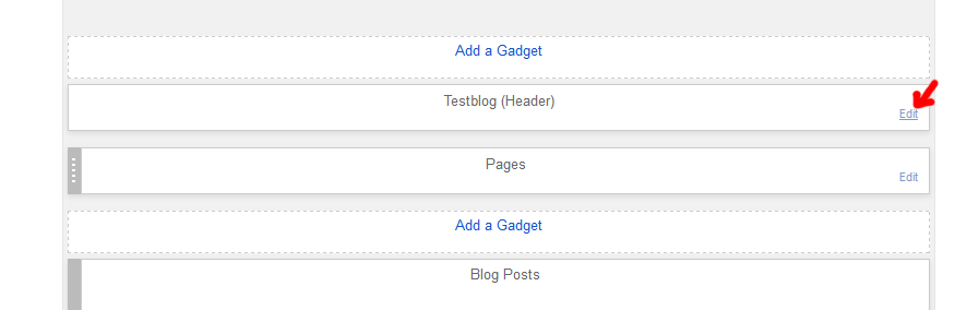
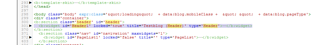
Dafür müsst ihr zuerst das Header-Gadget entfernen.
Am einfachsten ist es im HTML einfach das ganze Gadget zu löschen. Dank den neuen Klappen des Editors ist es alles auf einer Zeile zusammengefasst.
I personally prefer version 2.
First you need to remove the header widget, by deleting the code in the HTML
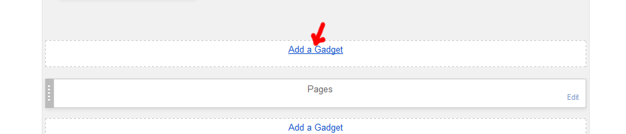
Sobald ihr das entfernt habt, speichert und wechselt zum Layout.
An der Stelle des Headers fügt ihr ein HTML Gadget hinzu, mit folgendem Inhalt:
As soon as you did that, save and change to layout.
Where the header used to be you want to add a html widget with the follwing content.
Die CSS fügen wir hier direkt unterhalb ein:
We add the following CSS.
Der gesamte Inhalt des Gadgets ist also:
The complete content of the widget is this:
Speichern und ihr seid fertig.
Save and you're done.
As allways, if there are any questiosn left, write a comment.
edit
Heute möchte ich euch zeigen, wie ihr "Coutout Images" in Gimp erstellt und dann in euren Blog einfügt. Als Cutout Image bezeichne ich Bilder, die so aussehen, als wären sie ausgeschnitten worden. Das heisst in eurem Blog-Container habt ihr ein "Loch", das euren Hintergrund durchscheinen lässt.
Um das ganze zu verbildlichen, habe ich ein Demo geschrieben.
Hello Everyone :)
Today I want to show you how to create and implement cutout images in your blog. I call them cutout because that's what it looks liks. Inside of your container you'll have an image cut out. I wrote a demo so you can see the effect.
Demo
Gimp
Okay, um so etwas zu machen, öffnet ihr Gimp und erstellt ein neues Bild.Dann schreibt, zeichnet, erstellt ihr euer Bild, das ausgeschnitten werden soll. Das ganze macht ihr in Schwarz auf weissem Hintergrund (wenn euer Container-Hintergrund weiss ist) Wenn ihr gewisse Details nur halbtransparent haben wollt, dann verwendet ihr grau. Alles was sichtbar bleiben soll, bleibt weiss.
Für mich sah das dann so aus:
Okay, to create something like this, open up gimp and create a new image.
Then write, draw, create the image that you want to cut out. You are going to do this using black on white (if white is the background of your container). If you wish for some details to be just semi-transparent, use gray. Everything that should remain visible, stays white.
That's what it looked like for me:
Ich habe das ganze noch auf verschiedenen Ebenen gehabt, damit ich damit experimentieren soll, aber schlussendlich wollen wir nur eine Ebene haben, also müssen wir sie alle zusammenlegen.
Das macht ihr mit Image -> Merge Visible Layers
I had it all on different layers because I find it easier if I can move every element around. But in the end we need one layer. So we need to merge them. Choose Image -> Merge Visible Layers
Eine einzige Ebene bleibt übrig. Jetzt wird das ganze ausgeschnitten. ^^
Geht zu Color -> Color to Alpha und wählt dann schwarz als zu entfernende Farbe aus.
Alles was schwarz war, wird transparent.
A single layer is left. Now we cut out. ^^
Go to Color -> Colot to Alpha and choose black as the color to be removed.
Everything that was black is now transparent.
Wenn ihr wollt, schneidet das Bild noch zurecht und dann könnt ihr es exportieren. Stellt sicher, dass ihr euer Bild als .png-Datei speichert.
If you want to, cut the image and then you are ready to export. Make sure you save your image as a .png-file.
Und dann seid ihr ready um das ganze hochzuladen :)
And then we are ready to upload.
Add to Blog
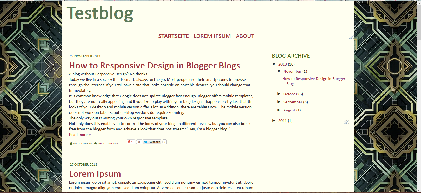
Okay, das ganze laden wir jetzt hoch. Ich verwende in meinem Beispiel mein Minima Responsive Template. Wenn ihr das in einer anderen Vorlage hochladen wollt, müsst ihr evtl. noch ein paar Zeilen zusätzliche CSS schreiben.Okay, we upload it now. I'm using my Minima Responsive Template for this example. If you want to use it in a different layout you may need to add a little more CSS.
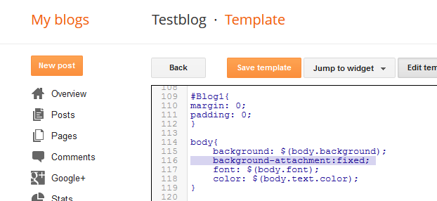
Fix Background Image
Damit der Effekt richtig gut aussieht, würde ich den Hintergrund fixieren. Das könnt ihr entweder über den Vorlagendesigner, oder direkt im HTML.Im Vorlagendesigner entfernt ihr einfach das Häkchen, dass der Hintergrund nicht mitscrollen soll.
For the effect to look best I'd fix the background. You can do this either in the template designer or directly inside the code.
In the template designer just remove the tick for the background to not scroll.
Ansonsten fügt ihr einfach eine Zeile CSS bei body hinzu:
Otherwise just add this line to your body-CSS.
background-attachment:fixed; Und damit der Container nicht so oben am Rand klebt, könnt ihr noch einen Rand hinzufügen. Dazu einfach nach folgender CSS suchen:
And so that the container does not stick to the top, you can add a margin by searching the following CSS
.container{
 max-widh: 1300px;
 background: $(container.background.color);
 position: realtive;
 margin: 0 auto;
}
Und bei der letzten Zeile das 0 von margin durch einen Wert ersetzen, der euch optisch gefällt. Ich habe mich für 100px entschieden, die dann oberhalb und unterhalb des Containers angezeigt werden.
Meine Zeile lautet also:
And replacing the 0 in margin with the number you like best. for me it was 100px and my finished line looks like this:
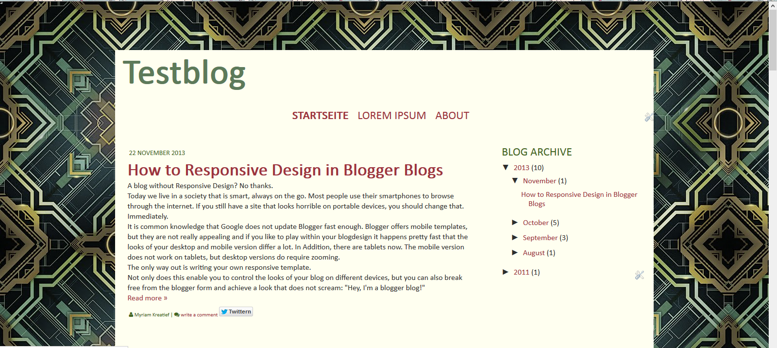
margin: 100px auto;Jetzt können wir das Bild einfügen.
Now we can add the image
Version 1: Header Widget
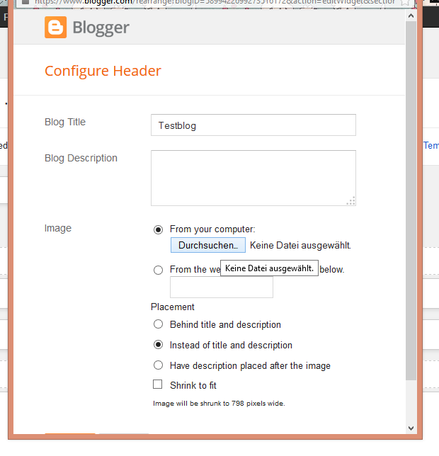
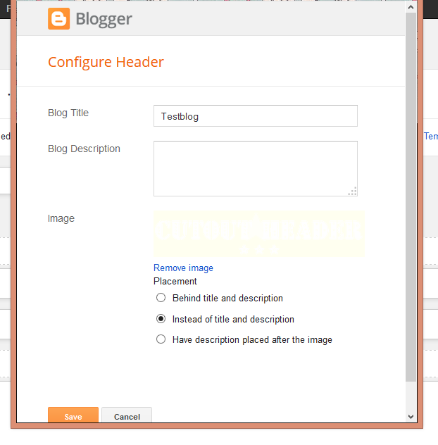
Hier öffnet ihr das Header-Widget und ladet das Bild hoch. Dazu wählt ihr die gleichen Einstellungen aus, wie auf dem Bild gezeigt. Dann speichern.Open up the header widget and upload the image making sure to make he same adjustments I did. Then save.
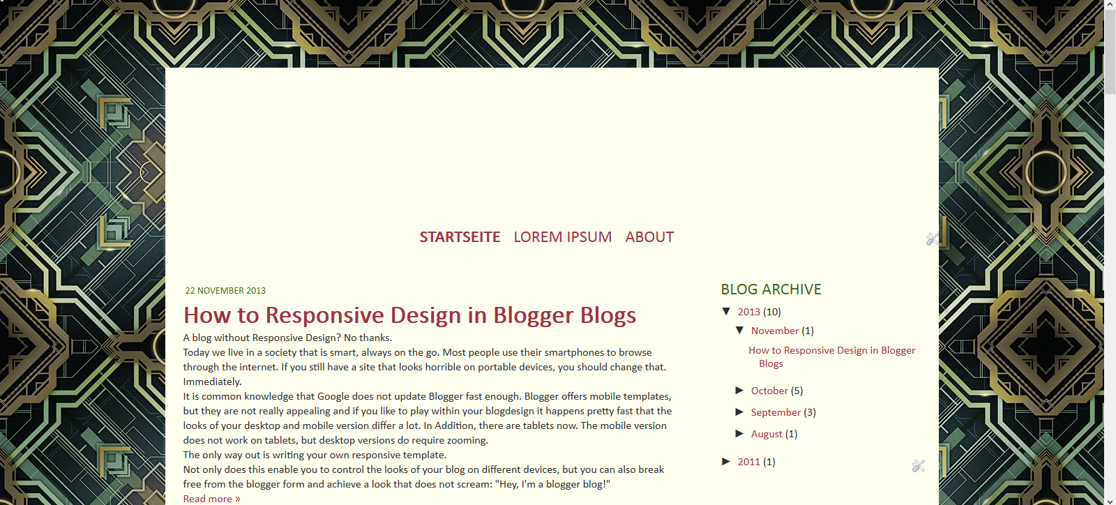
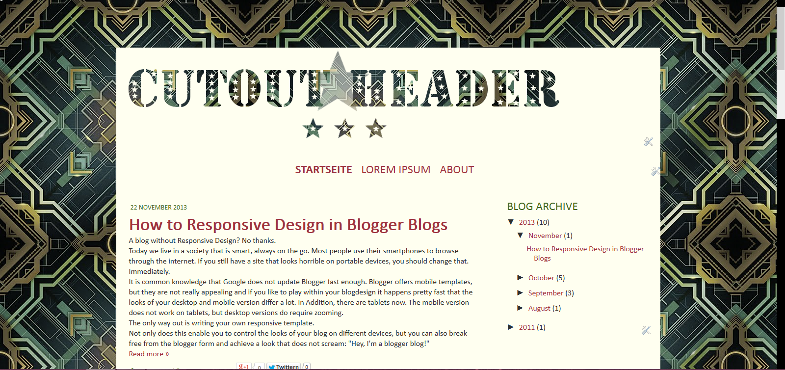
Aussehen tut das ganze dann so:
I will look like this:
Genau, man kann gar nichts sehen. Das ändern wir nun mit etwas CSS.
Als erstes brauchen wir den Link unseres Hintergrundes. Das könnt ihr entweder im Code suchen, oder aber ihr lasst euch über Rechtsklick auf den Bloghintergrund das Bild anzeigen und könnt die URL aus der Adresszeile kopieren. Speichert euch die URL irgendwo ab.
Exactly, you can't see anything. We'll change that with a little bit of CSS.
First you need the link of your backgkround. YOu can check in the code or just rightclick on the background, grab the image and get the link there. Save this URL somewhere.
Gut, jetzt kommen wir zur CSS, die wir einfügen.
Die könnt ihr über den Vorlagendesigner hinzufügen, oder im Code.
Ich mache es im Code.
Dazu sucht ihr nach:
Okay, now for the CSS. you can add it in the template desinger or in the code. That's what I'm gonna do.
Search for:
]]></b:skin>Oberhalb davon fügt ihr folgendes ein. Das Bild wird mit diesem Code gleich noch zentriert. Falls ihr das nicht wollt, entfernt einfach die margin-Zeile.
Above that put the following. This CSS does center the header at the same time. If you don't want that, just remove the margin-line.
#Header1 img{
    background: url(BG_URL) repeat fixed;
    margin: 0 auto;
}
Speichern und der Cutout-Effekt ist fertig. :)
Save and the cutout-effect is done :)
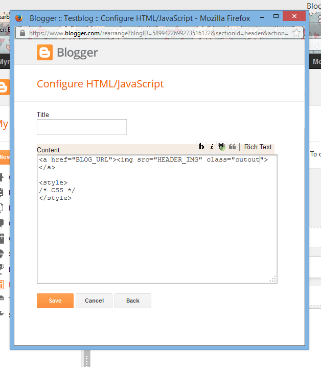
Version 2: HTML Widget
Version 2, ziehe ich persönlich vor.Dafür müsst ihr zuerst das Header-Gadget entfernen.
Am einfachsten ist es im HTML einfach das ganze Gadget zu löschen. Dank den neuen Klappen des Editors ist es alles auf einer Zeile zusammengefasst.
I personally prefer version 2.
First you need to remove the header widget, by deleting the code in the HTML
Sobald ihr das entfernt habt, speichert und wechselt zum Layout.
An der Stelle des Headers fügt ihr ein HTML Gadget hinzu, mit folgendem Inhalt:
As soon as you did that, save and change to layout.
Where the header used to be you want to add a html widget with the follwing content.
<a href="BLOG_URL"><img src="HEADER_IMG" class="cutout"></a>Die CSS fügen wir hier direkt unterhalb ein:
We add the following CSS.
.cutout{
    background: url(BG_URL) repeat fixed;
}
Der gesamte Inhalt des Gadgets ist also:
The complete content of the widget is this:
<a href="BLOG_URL"><img src="HEADER_IMG" class="cutout"></a>

<style>
.cutout{
    background: url(BG_URL) repeat fixed;
}
</style>
Speichern und ihr seid fertig.
Save and you're done.
Questions
Wie immer, bei Fragen oder Anmerkungen, schreibt mir einen Kommentar.As allways, if there are any questiosn left, write a comment.
2 comments:
Fragen, Feedback oder anderes, was du loswerden willst?
Kommentiere über das alte Kommentarsystem (check wieder vorbei um zu sehen, ob ich geantwortet habe) oder G+
Questiosn, Feedback or something else you want to tell me?
Comment using the old system or G+ and make sure to check back to see if I answered
Schöne Idee...werde ich mir am Wochenende mal näher anschauen...lieben Dank! LG Lotta.
ReplyDeleteAloha,
ReplyDeletewir haben deinen Beitrag auf unserer Facebookseite "blogARTig" verlinkt.
Solltest du etwas dagegen haben, bitte laut schreien.
Liebste Grüße
blogARTig